Example six-step outline
This section provides a recommended pipeline for researchers who are using the bigPint package to visualize RNA-seq data. Researchers may chose to tailor this suggested pipeline accordingly. For instance, if a user is investigating an RNA-seq dataset with a very large number of samples, the scatterplot matrix may be difficult to use on all samples at once. As a result, the user can simply not use the scatterplot matrix or may choose to perform the scatterplot matrix on random subsets of samples.
The first two steps should be performed on the normalized count table (i.e. Data object) before DEG designation:
1. Create a side-by-side boxplot on full data (before DEG designation)
- Check that five number summary is consistent across samples. Deviation may indicate that the data require a different normalization technique.
2. Create scatterplot matrix on full data (before DEG designation)
- Check that most genes fall along the x=y line. Deviation may indicate that the data require a different normalization technique.
- Check that treatment scatterplots have larger variability than replicate scatterplots. If the reverse is seen in some scatterplots, then samples may have been mislabeled.
- Check for strange geometric features. Streaks of outliers in several scatterplots may require specific normalization techniques. Streaks of outliers in replicate scatterplots may capture genes that were inadvertently differentially expressed due to unintended differences in replicates.
Once the normalized count table (i.e. Data object) passes the first two steps and any inadequate normalization and/or questionable patterns have been accounted for, then the user should apply a model through packages like edgeR (Robinson, McCarthy, and Smyth 2010), DESeq2 (Love, Huber, and Anders 2014), or limma (Ritchie et al. 2015)) to obtain statistical (e.g. p-value) and quantitative (e.g. log fold change) values for each gene in the dataset. After that, the user should continue with the last four steps. For these steps, you will need the normalized count table (i.e. Data object) and the DEG designation table (i.e. Data metrics object).
3. Perform hierarchical clustering and plot the standardized parallel coordinate lines for each cluster of significant genes.
- Check that parallel coordinate lines appear as DEGs should. Whole clusters may show questionable DEG calls or normalization issues.
4. Plot raw and standardized scatterplot matrices for each cluster of significant genes.
- Check that DEG points overlaid on scatterplot matrix appear as DEGs should. Whole clusters may show questionable DEG calls or normalization issues. The standardized version may be helpful to magnify subtle patterns.
5. Plot raw and standardized litre plots for each cluster of significant genes.
- Flip through litre plots for DEG points overlaid on litre plots and check that they appear as DEGs should. Whole clusters may show questionable DEG calls or normalization issues. The standardized version may be helpful to magnify subtle patterns.
6. Plot DEGs onto volcano plot.
- Determine whether DEGs are not only statistically significant, but also have large magnitude changes.
Step 1: Side-by-side boxplot
Please be sure you have installed bigPint before following this pipeline. First, we will read in our example data, soybean_cn_sub. This is public RNA-seq data derived from soybean cotyledon at different time points. We will consider two treatment groups (S1 and S3) that each have three replicates (Brown and Hudson 2015). We will refer to this count table as data. Check that your data object is in the format bigPint expects by refering to the article (i.e. Data object). An example of the data structure is shown below.
library(bigPint)
library(dplyr)
library(ggplot2)
library(plotly)
data("soybean_cn_sub")
data = soybean_cn_sub %>% select(ID, starts_with("S1"), starts_with("S3"))
str(data, strict.width = "wrap")
#> 'data.frame':    7332 obs. of  7 variables:
#> $ ID : chr "Glyma06g12670.1" "Glyma08g12390.2" "Glyma12g02076.11"
#>    "Glyma18g53450.1" ...
#> $ S1.1: num 0.802 4.769 3.19 0.802 3.19 ...
#> $ S1.2: num 2.709 5.236 2.902 0.802 2.48 ...
#> $ S1.3: num 1.763 5.167 2.907 0.802 3.262 ...
#> $ S3.1: num 8.557 3.669 3.364 0.802 4.4 ...
#> $ S3.2: num 8.368 4.031 2.731 0.802 3.42 ...
#> $ S3.3: num 8.389 4.269 3.256 0.802 4.144 ...
We will also create a standardized version of this count table, which we will refer to as data_st. In the standardized case, each gene will have a mean of zero and a standard deviation of one across its samples (Chandrasekhar, Thangavel, and Elayaraja 2012).
data_st <- as.data.frame(t(apply(as.matrix(data[,-1]), 1, scale)))
data_st$ID <- as.character(data$ID)
data_st <- data_st[,c(length(data_st), 1:length(data_st)-1)]
colnames(data_st) <- colnames(data)
nID <- which(is.nan(data_st[,2]))
data_st[nID,2:length(data_st)] <- 0
str(data_st, strict.width = "wrap")
#> 'data.frame':    7332 obs. of  7 variables:
#> $ ID : chr "Glyma06g12670.1" "Glyma08g12390.2" "Glyma12g02076.11"
#>    "Glyma18g53450.1" ...
#> $ S1.1: num -1.158 0.386 0.533 0 -0.42 ...
#> $ S1.2: num -0.644 1.121 -0.633 0 -1.44 ...
#> $ S1.3: num -0.899 1.012 -0.615 0 -0.317 ...
#> $ S3.1: num 0.933 -1.345 1.241 0 1.318 ...
#> $ S3.2: num 0.8816 -0.7748 -1.3259 0 -0.0904 ...
#> $ S3.3: num 0.887 -0.4 0.8 0 0.95 ...
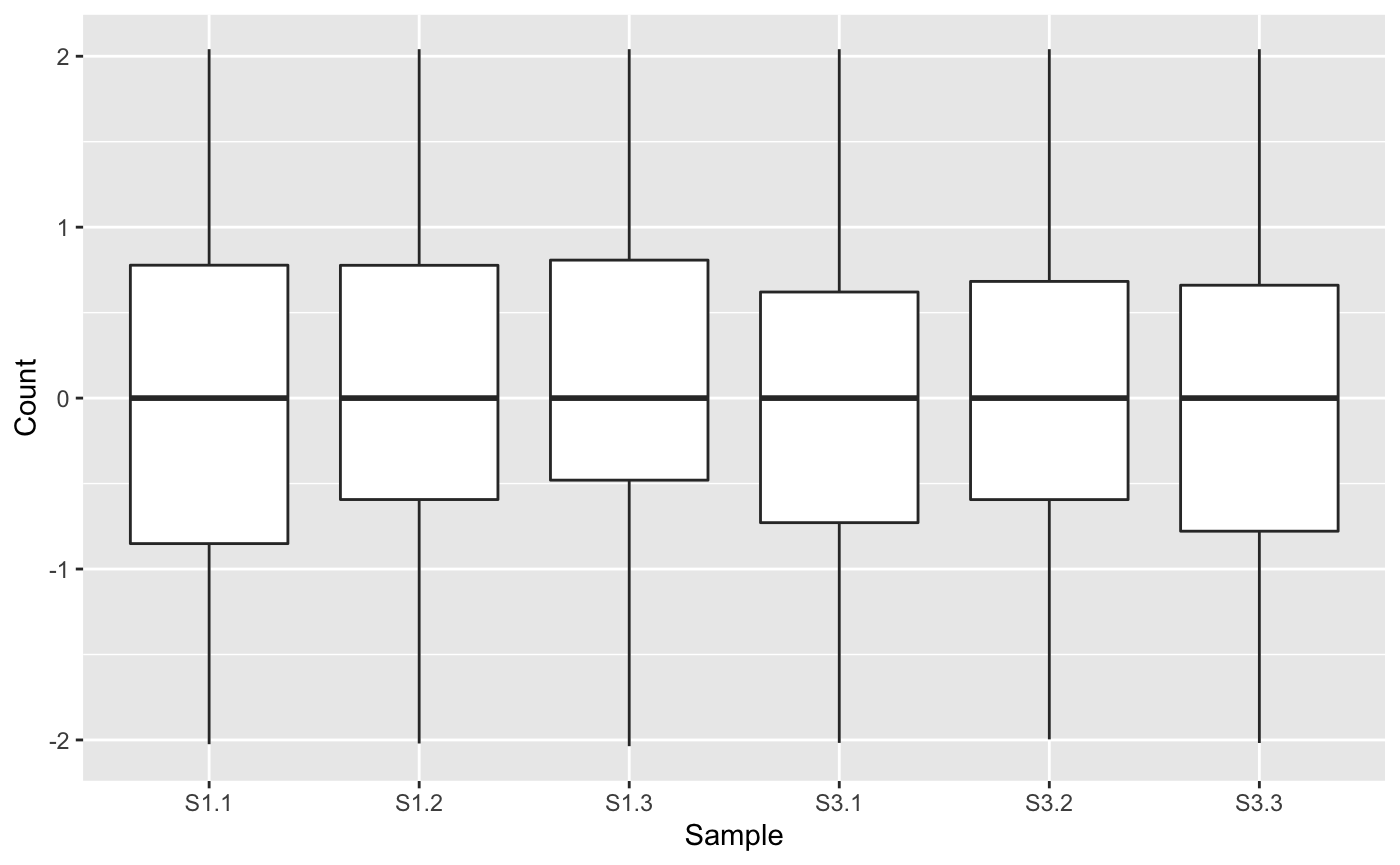
Next, we will generate a side-by-side boxplot of this data. We can check that the distribution of read counts (their five number summaries) is consistent across the six samples. If a user does not find that the side-by-side boxplots show consistent read count distributions across the samples, then they may wish to renormalize and/or remove outliers, using packages like edgeR (Robinson, McCarthy, and Smyth 2010), DESeq2 (Love, Huber, and Anders 2014), or limma (Ritchie et al. 2015). Here, we are setting the saveFile option to FALSE so we do not save these plots to any directory. See the article Producing static plots for more details.
ret <- plotPCP(data=data_st, saveFile = FALSE)
ret[["S1_S3"]]
Step 2: Scatterplot matrix
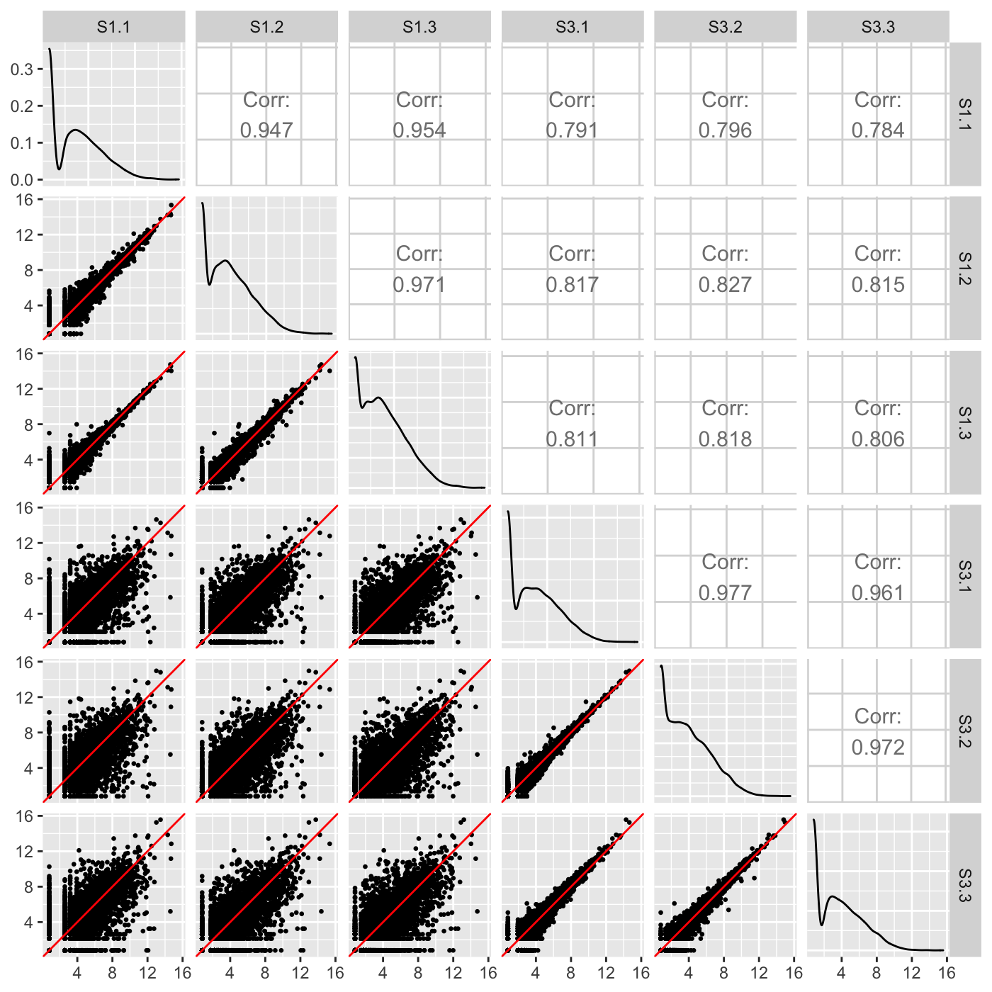
Examining the normalized count table as a scatterplot matrix can help us check for normalization problems, strange geometric features that need to be considered, and problems in variability between replicates and treatments. Unlike the side-by-side boxplot, it allows us to investigate each individual gene in the data. We confirm in our plot below that:
- The nine treatment scatterplots show more variability around the x=y line than the six replicate scatterplots
- The data appears normalized (the genes center on the x=y line in each scatterplot)
- There are no unexpected geometric features or outlier streaks.
ret <- plotSM(data=data, saveFile = FALSE)
ret[["S1_S3"]]
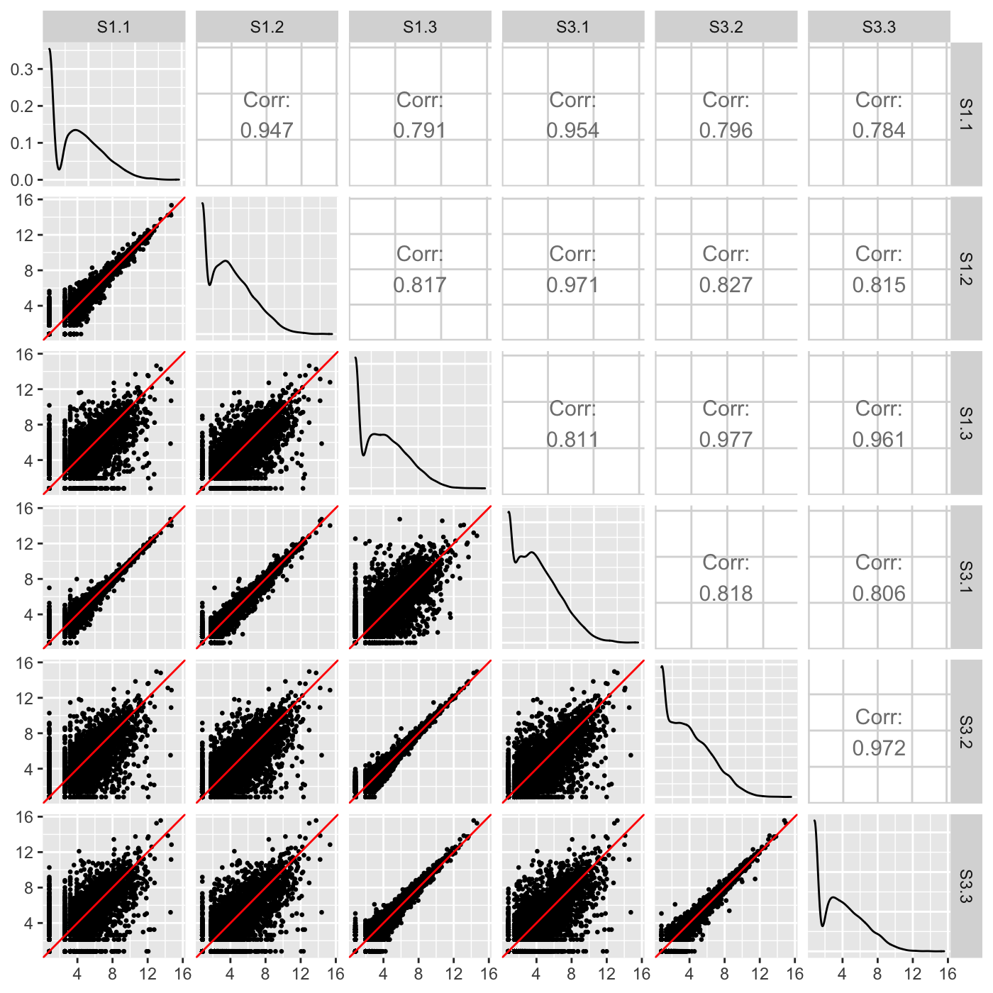
Our normalized data appeared as expected in the scatterplot matrix above, but we briefly show three example cases users can look out for when using the scatterplot matrix to detect issues in their data. The first case is when the variability around the x=y line is not as expected for the treatment versus replicate scatterplots. Notice how the scatterplot below has nine scatterplots with large variation around their x=y line and six scatterplots with little variation around their x=y line? These are the numbers we expect, but we expect the nine scatterplots with large variation to all be located in the bottom-left corner of the matrix as they should belong to the treatment scatterplots. In an example like this, the user may wish to double-check that samples were not switched to cause such unexpected trends in sample variability. In fact, for didactic purposes, we deliberately switched samples S1.3 and S3.1.
dataSwitch <- data[,c(1:3, 5, 4, 6:7)]
colnames(dataSwitch) <- colnames(data)
ret <- plotSM(data=dataSwitch, saveFile = FALSE)
ret[["S1_S3"]]
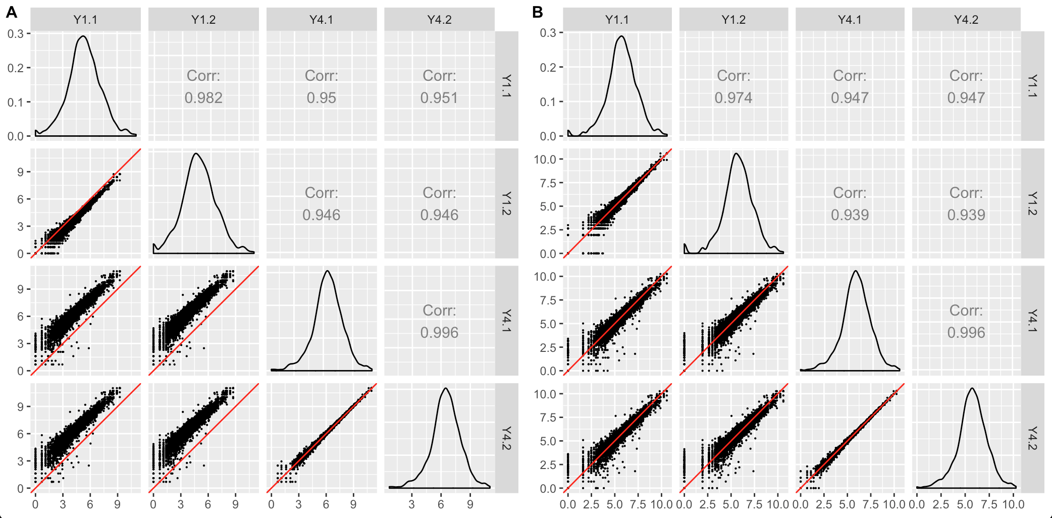
The second case occurs when the scatterplot matrix reveals normalization issues. The plot below shows one such example from a public dataset of Saccharomyces cerevisiae (yeast) grown in YPGlucose (YPD) (Risso et al. 2011). The deviation of genes from the x=y line instantly reveals that the RNA-seq dataset was not thoroughly normalized using within-lane normalization (subplot A). However, within-lane normalization followed by between-lane normalization sufficiently normalized the data (subplot B). This example shows that the user can work iteratively between graphics and models: They can update model parameters and normalization techniques until their visualizations show that the model now makes sense.
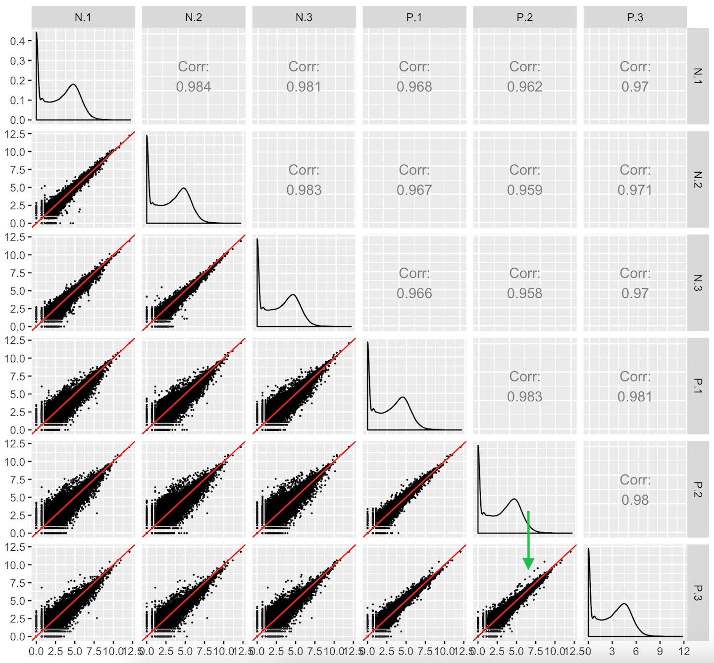
This third case users should look out for are aberrant geometric patterns or streaks of outliers in the scatterplot matrix. Below is scatterplot matrix of public RNA-seq data from soybean leaves after exposure to iron-sufficient (group P) and iron-deficient (group N) hydroponic conditions (Lauter and Graham 2016). Notice a pronounced streak structure in the bottom-right scatterplot (green arrow) that compares two replicates from the P group.
Models cannot reveal such interesting structures that could lead to informative post hoc analyses. For instance, if this structure presented itself in data where the data collection technicians had noted an inadvertent experimental or biological inconsistency between those replicates, then a post hoc hypothesis that these genes might respond to that discrepant condition could be proposed. We note that this would only serve as a hypothesis generator; conventional genetic studies would be necessary to verify any potential role these genes have on this biological process.
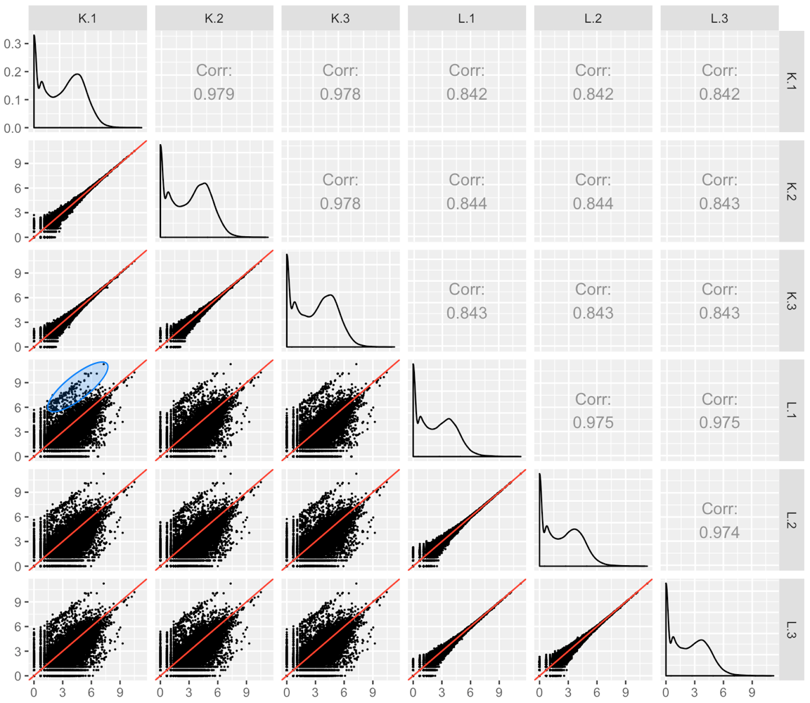
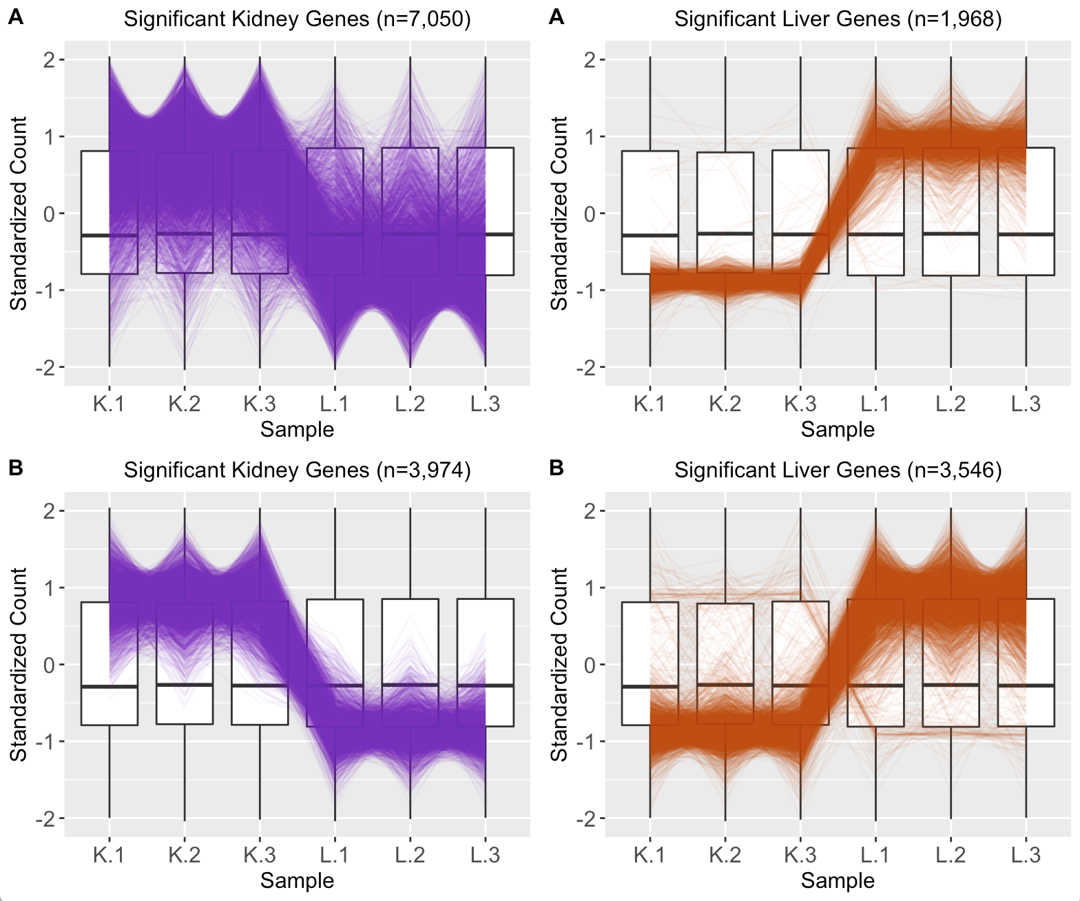
 We provide another example of this third case; below is the scatterplot matrix of a public RNA-seq data of human liver and kidney technical replicates (Marioni et al. 2008). The technical replicate scatterplots look precise as is expected since this is technical data. The treatment group scatterplots have more variability around the x=y line, as we would also anticipate. However, the treatment scatterplots each contain a pronounced streak of highly-expressed liver-specific genes (highlighted as a blue oval in one example scatterplot). Some researchers have suggested that differences in the distribution of reads between groups may require particularly stringent normalization (MD Robinson and Oshlack 2010). We return to this problem in a later step.
Step 3: DEG parallel coordinates and clusters
Now that we have examined the normalized data, we can use a model to determine statistical (e.g. p-value) and quantitiatve (e.g. log fold change) values for each gene in the dataset and create our dataMetrics object. Be sure that your dataMetrics object follows the expected format, which is outlined in the article Data metrics object. Below, we use the edgeR package (Robinson, McCarthy, and Smyth 2010) to create and view our dataMetrics object.
library(edgeR)
library(data.table)

rownames(data) = data[,1]

y = DGEList(counts=data[,-1])
group = c(1,1,1,2,2,2)
y = DGEList(counts=y, group=group)
Group = factor(c(rep("S1",3), rep("S3",3)))
design <- model.matrix(~0+Group, data=y$samples)
colnames(design) <- levels(Group)
y <- estimateDisp(y, design)
fit <- glmFit(y, design)

dataMetrics <- list()

contrast=rep(0,ncol(fit))
contrast[1]=1
contrast[2]=-1
lrt <- glmLRT(fit, contrast=contrast)
lrt <- topTags(lrt, n = nrow(y[[1]]))[[1]]

lrt <- setDT(lrt, keep.rownames = TRUE)[]
colnames(lrt)[1] = "ID"
lrt <- as.data.frame(lrt)

dataMetrics[[paste0(colnames(fit)[1], "_", colnames(fit)[2])]] <- lrt
str(dataMetrics, strict.width = "wrap")
#> List of 1
#> $ S1_S3:'data.frame': 7332 obs. of 6 variables:
#> ..$ ID : chr [1:7332] "Glyma08g22380.1" "Glyma08g19290.1" "Glyma20g30460.1"
#>    "Glyma18g00690.1" ...
#> ..$ logFC : num [1:7332] 3.18 3.32 2.44 2.46 3.03 ...
#> ..$ logCPM: num [1:7332] 8.34 8.05 8.43 8.38 8.06 ...
#> ..$ LR : num [1:7332] 30.4 24.7 23.3 22.5 22.3 ...
#> ..$ PValue: num [1:7332] 3.60e-08 6.53e-07 1.42e-06 2.09e-06 2.30e-06 ...
#> ..$ FDR : num [1:7332] 0.000264 0.002393 0.003378 0.003378 0.003378 ...
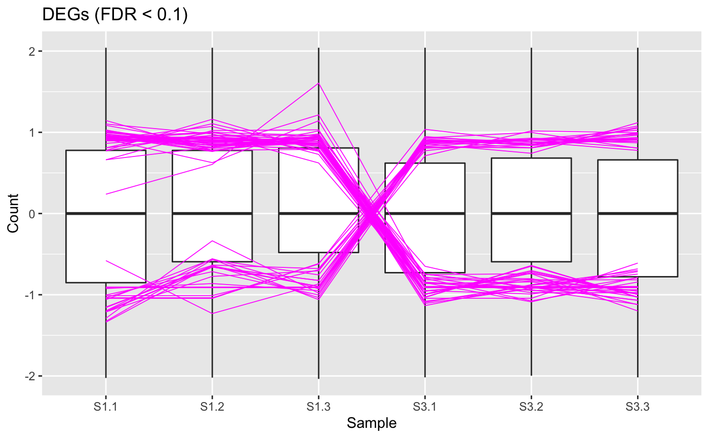
At this point, we can view our DEGs (which we consider to be genes with FDR < 0.1). Below we show a standardized parallel coordinate plot and scatterplot matrix with the DEGs superimposed in magenta. The DEGs follow the patterns we expect, which were described in the article Introduction to bigPint plots.
ret <- plotPCP(data_st, dataMetrics, threshVal = 0.1, lineSize = 0.3,
  lineColor = "magenta", saveFile = FALSE)
ret[["S1_S3"]] + ggtitle("DEGs (FDR < 0.1)")
The user can recreate the parallel coordinate plot in a fashion that allows them to quickly hover over individual parallel coordinates and determine their individual gene IDs by setting the hover parameter to a value of TRUE.
ret <- plotPCP(data_st, dataMetrics, threshVal = 0.1, lineSize = 0.3,
  lineColor = "magenta", saveFile = FALSE, hover = TRUE)
ret[["S1_S3"]] %>% layout(title="DEGs (FDR < 0.1)")
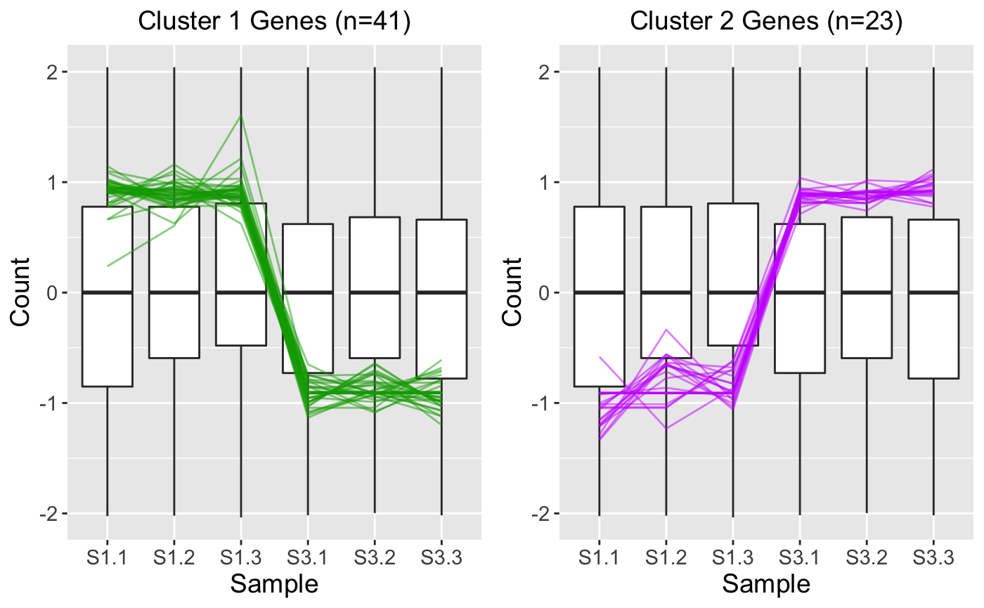
While the parallel coordinate plot above confirms that the DEG calls appear reliable, some users may find that superimposing all DEGs at once will create bigPint plots that are difficult to interpret. This is especially true in datasets with low signal:to:noise ratios and/or large number of DEGs. In these cases, it can be helpful to perform hierarchical clustering on the DEGs to group them into more manageable sizes of similar patterns and then examine these plots for each separate cluster. Here, we create two DEG clusters and examine their parallel coordinate plots. We see that the first cluster captured 41 DEGs with larger expression in the S1 group and the second cluster captured 23 DEGs with larger expression in the S3 group. Because we set the verbose parameter to a value of TRUE, we also generate .rds files that contain the gene IDs within these clusters in outDir, which is tempdir() by default. You can find the exact pathway of your temporary directory by typing tempdir() into your R console. We will use these .rds files in the last three steps.
ret <- plotClusters(data_st, dataMetrics, threshVal = 0.1, nC = 2,
  colList = c("#00A600FF", "#CC00FFFF"), lineSize = 0.5, verbose = TRUE)
plot(ret[["S1_S3_2"]])
The above parallel coordinate plots show reliability in the DEG designation. However, parallel coordinate plots can diagnose cases in which the DEG calls are questionable. As a case in point, we return to the public RNA-seq data of human liver and kidney technical replicates that previously showed pronounced streaks of highly-expressed liver-specific genes (highlighted in blue ovals) in its scatterplot matrix (Marioni et al. 2008). As we mentioned earlier, researchers suggest that differences in the distribution of reads between groups may require particularly stringent normalization (MD Robinson and Oshlack 2010).
Indeed, subplot A of the parallel coordinate plot below shows the DEGs from this data after library scale normalization (Marioni et al. 2008). The division of DEGs between the two groups was disparate, with 78% of the DEGs being kidney-specific and only 22% of the DEGs being liver-specific. While the parallel coordinate patterns of the liver-specific DEGs appear as expected, the patterns of the kidney-specific DEGs seem to show comparatively larger variability between the replicates. Subplot B shows parallel coordinate plots of the DEGs after TMM normalization. The division of DEGs between the two groups is now more balanced, with 53% of the DEGs being kidney-specific and 47% of the DEGs being liver-specific. Additionally, the parallel coordinate patterns of both the liver-specific and kidney-specific DEGs appear as expected and more consistent with each other. Hence, these parallel coordinate plots could immediately alert users that DEGs may be more reliable for this dataset when TMM normalization is used.
Step 4: DEG scatterplot matrix
We can read the .rds files to obtain the IDs of the DEGs in the two clusters we generated in Step 3. Here, we read in the 41 Cluster 1 genes and the 23 Cluster 2 genes.
We can quickly check that these .rds files indeed contain the gene IDs for the 41 DEGs in Cluster 1 and 23 DEGs in Cluster 2.
S1S3Cluster1
#>  [1] "Glyma08g22380.1" "Glyma08g19290.1" "Glyma20g30460.1" "Glyma18g00690.1"
#>  [5] "Glyma14g14220.1" "Glyma07g09700.1" "Glyma16g08810.1" "Glyma01g26570.1"
#>  [9] "Glyma08g19245.1" "Glyma03g29150.1" "Glyma12g10960.1" "Glyma02g40610.1"
#> [13] "Glyma08g11570.1" "Glyma18g42630.2" "Glyma17g17970.1" "Glyma07g01730.2"
#> [17] "Glyma18g25845.1" "Glyma08g44110.1" "Glyma19g26710.1" "Glyma10g34630.1"
#> [21] "Glyma19g26250.1" "Glyma14g40140.2" "Glyma12g31920.1" "Glyma15g14720.2"
#> [25] "Glyma10g31780.1" "Glyma13g26600.1" "Glyma02g01990.1" "Glyma08g03330.1"
#> [29] "Glyma14g05270.1" "Glyma13g22940.1" "Glyma05g31500.1" "Glyma12g04745.1"
#> [33] "Glyma05g31580.1" "Glyma11g21190.2" "Glyma01g42820.2" "Glyma12g28890.1"
#> [37] "Glyma05g28470.1" "Glyma10g30650.1" "Glyma04g03120.1" "Glyma02g03050.2"
#> [41] "Glyma08g45531.1"
S1S3Cluster2
#>  [1] "Glyma01g24710.1" "Glyma17g09850.1" "Glyma04g37510.1" "Glyma12g32460.1"
#>  [5] "Glyma04g39880.1" "Glyma18g52920.1" "Glyma05g27450.2" "Glyma06g12670.1"
#>  [9] "Glyma03g19880.1" "Glyma05g32040.1" "Glyma03g41190.1" "Glyma19g40670.2"
#> [13] "Glyma01g01770.1" "Glyma12g01160.1" "Glyma06g06530.1" "Glyma12g02040.1"
#> [17] "Glyma06g41220.1" "Glyma14g11530.1" "Glyma15g11910.1" "Glyma09g02000.1"
#> [21] "Glyma18g44930.2" "Glyma12g03450.1" "Glyma08g10435.1"
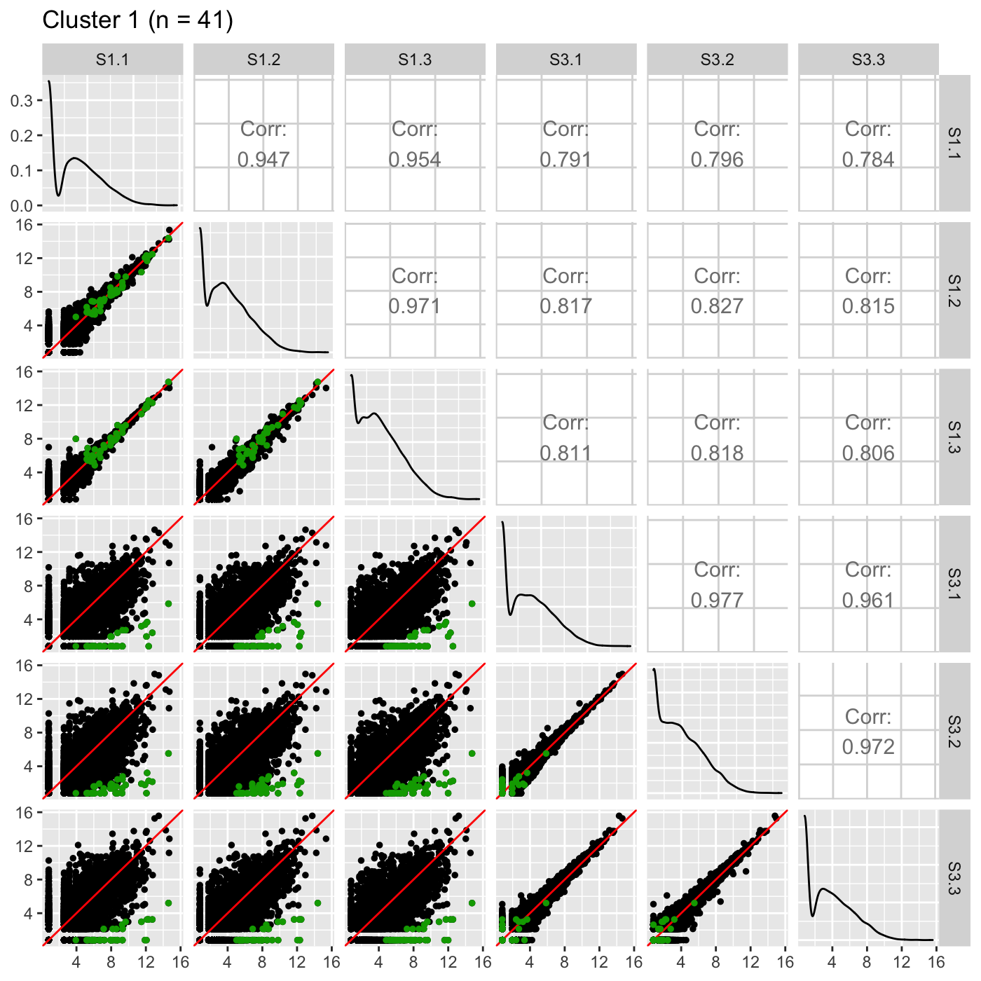
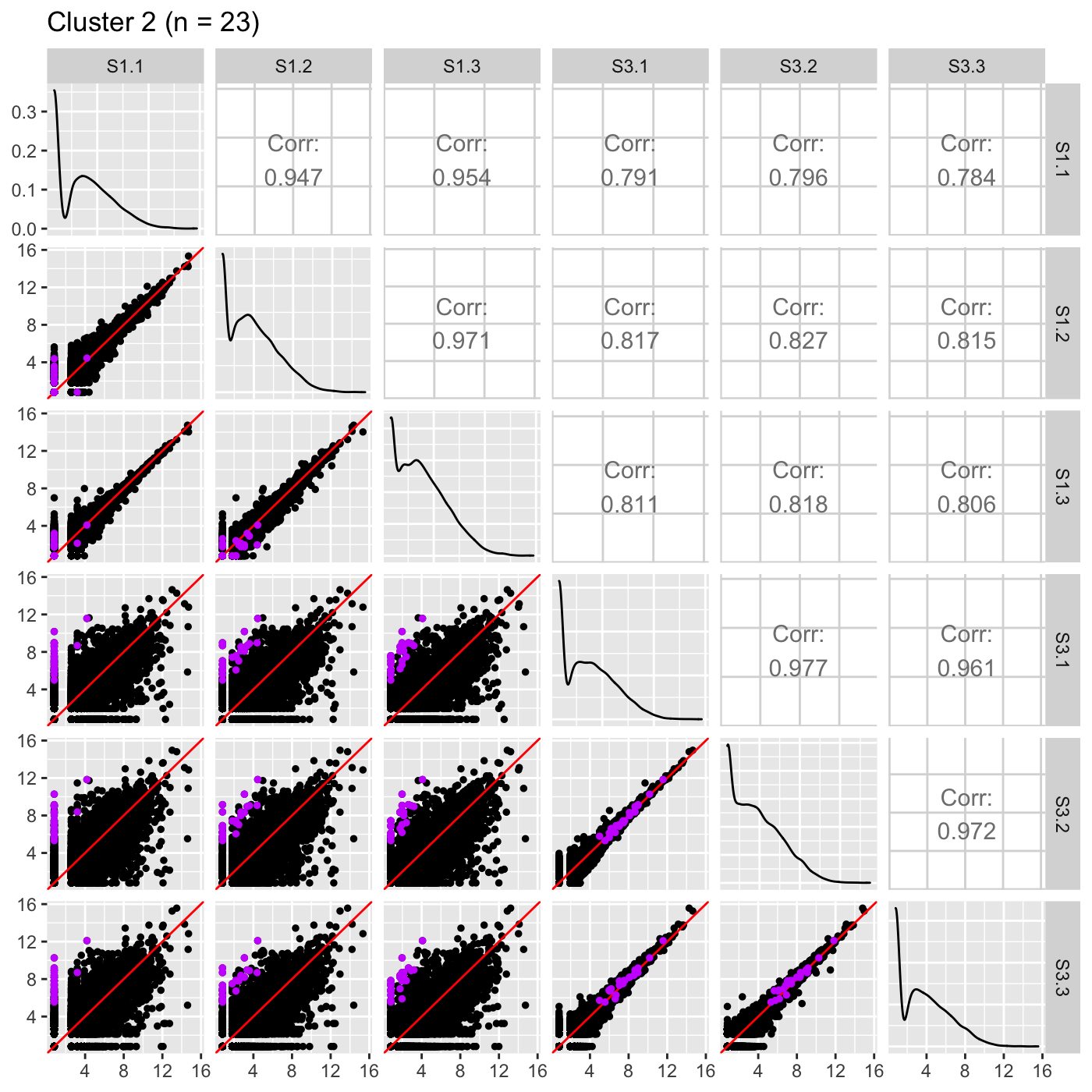
Now, we can reexamine the scatterplot matrix of DEGs for each of these clusters separately. We can maintain the same overlaying colors throughout this process.
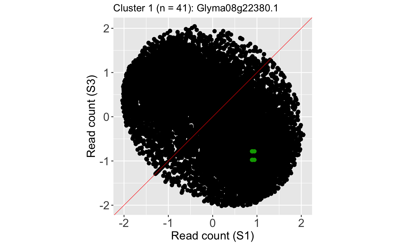
ret <- plotSM(data, geneList = S1S3Cluster1, pointColor = "#00A600FF",
  pointSize = 1, saveFile = FALSE)
ret[["S1_S3"]] + ggtitle(paste0("Cluster 1 (n = ", length(S1S3Cluster1), ")"))
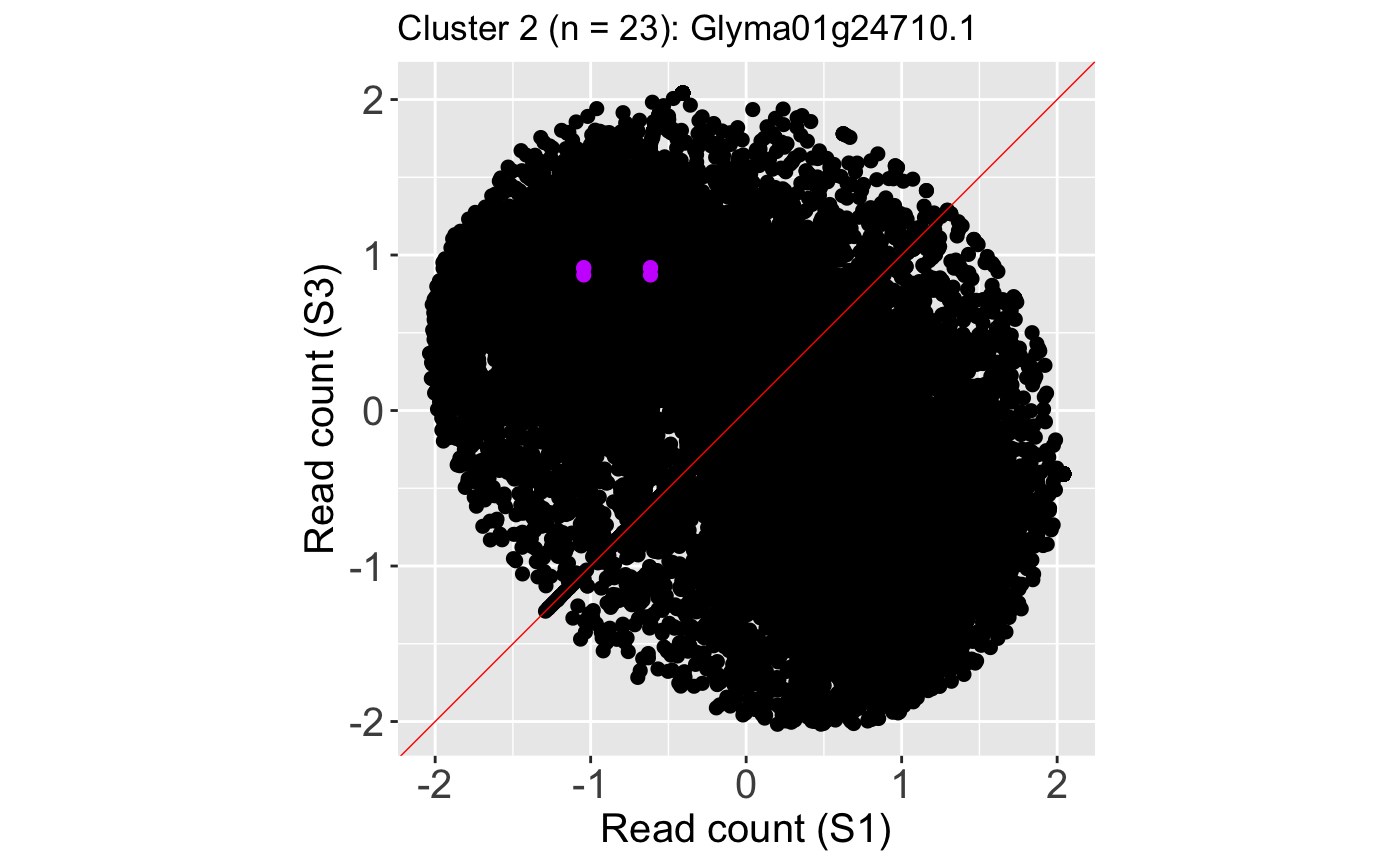
ret <- plotSM(data, geneList = S1S3Cluster2, pointColor = "#CC00FFFF",
  pointSize = 1, saveFile = FALSE)
ret[["S1_S3"]] + ggtitle(paste0("Cluster 2 (n = ", length(S1S3Cluster2), ")"))
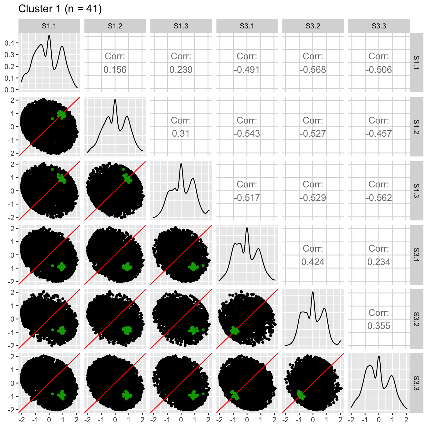
It is sometimes convenient to also view DEG scatterplot matrices using the standardized data.
ret <- plotSM(data_st, geneList = S1S3Cluster1, pointColor = "#00A600FF",
  pointSize = 1, saveFile = FALSE)
ret[["S1_S3"]] + ggtitle(paste0("Cluster 1 (n = ", length(S1S3Cluster1), ")"))
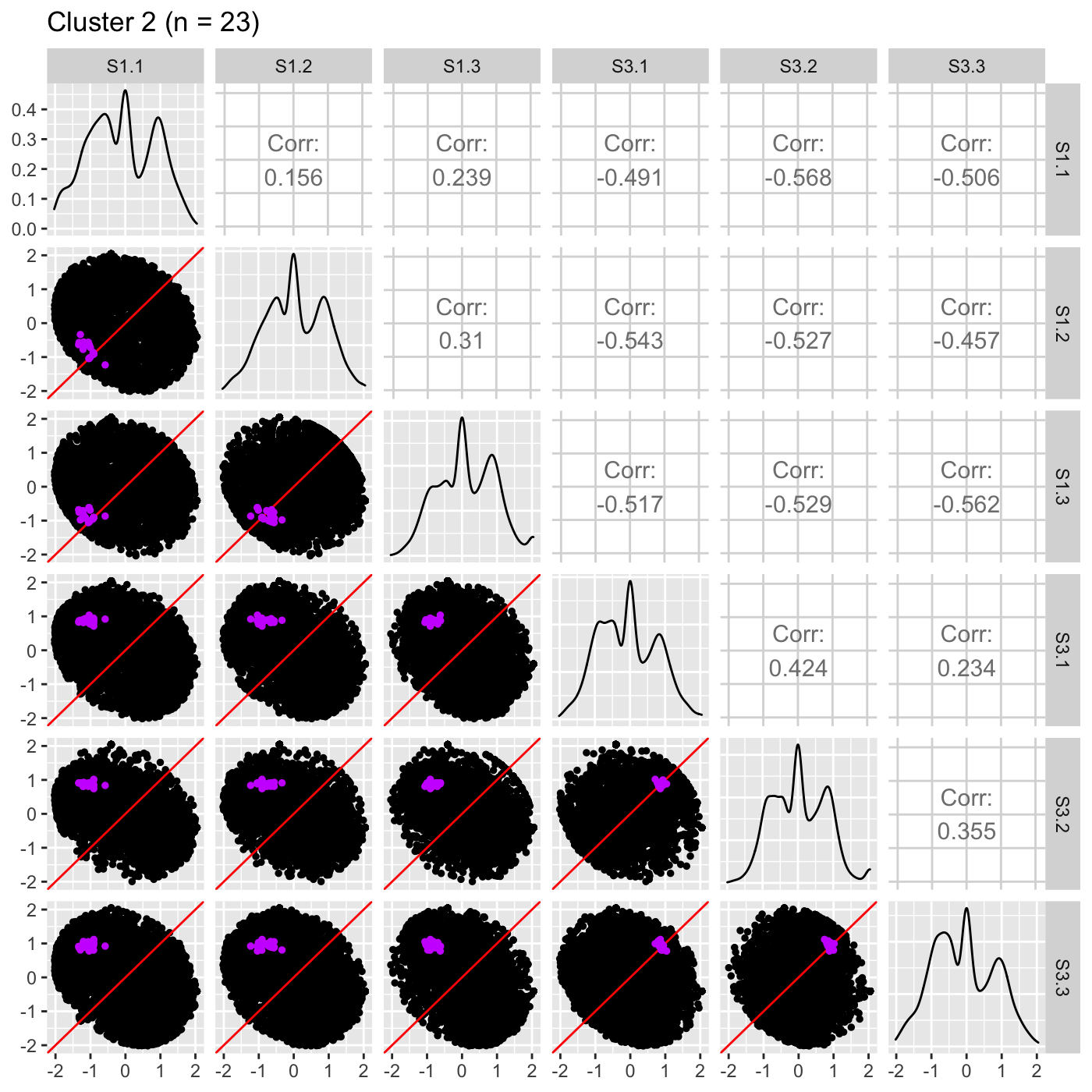
ret <- plotSM(data_st, geneList = S1S3Cluster2, pointColor = "#CC00FFFF",
  pointSize = 1, saveFile = FALSE)
ret[["S1_S3"]] + ggtitle(paste0("Cluster 2 (n = ", length(S1S3Cluster2), ")"))
Step 5: DEG litre plots
It is useful to investigate the DEGs individually; this can be accomplished using litre plots. Below we show an example litre plot for the DEG with the lowest FDR value in Cluster 1 (ID: “Glyma08g22380.1”).
ret <- plotLitre(data, geneList = S1S3Cluster1[1], pointColor = "#00A600FF",
  pointSize = 2, saveFile = FALSE)
ret[[1]] + ggtitle(paste0("Cluster 1 (n = ", length(S1S3Cluster1), "): ",
  S1S3Cluster1[1]))

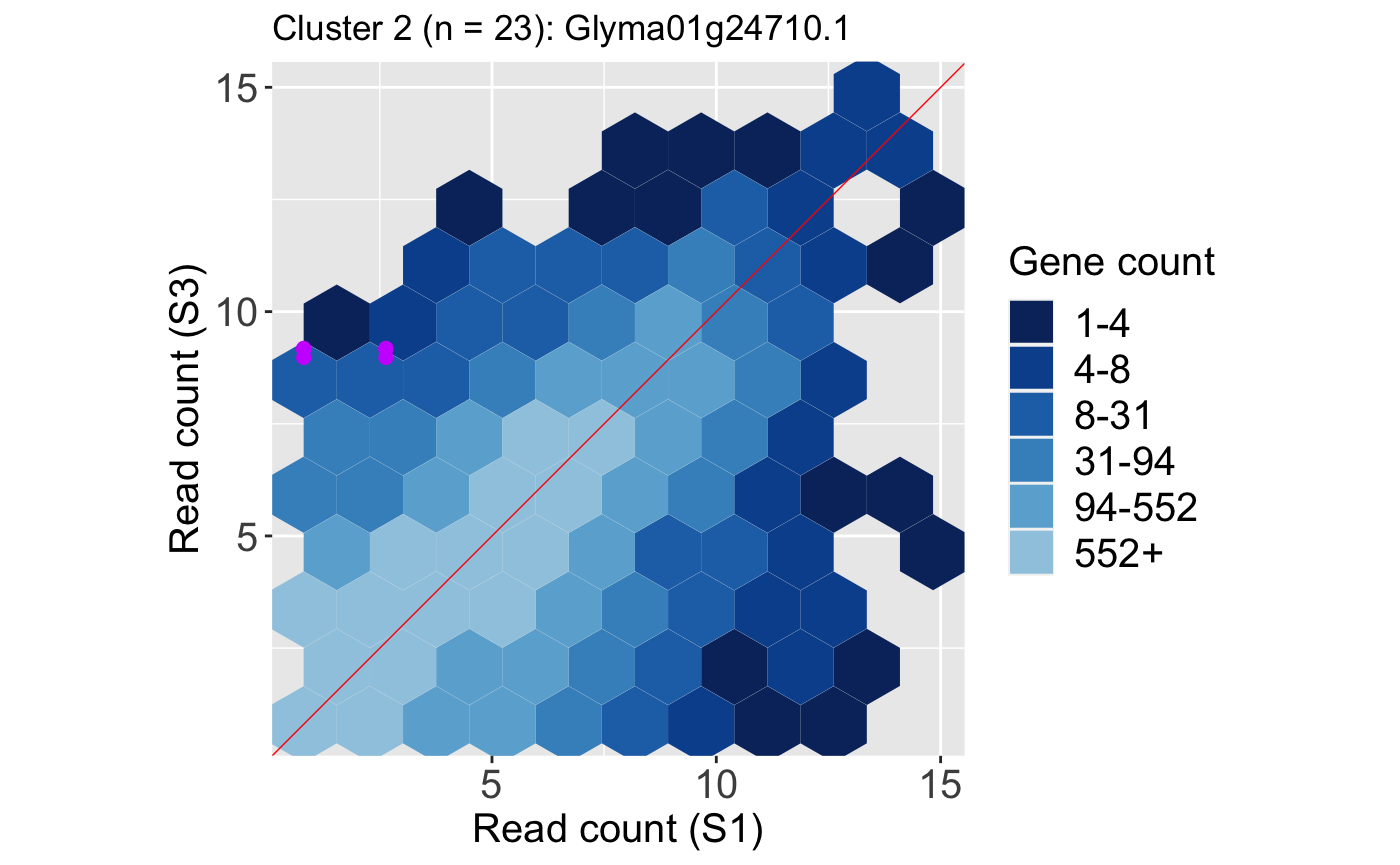
We also show an example litre plot for the DEG with the lowest FDR value in Cluster 2 (ID: “Glyma01g24710.1”).
ret <- plotLitre(data, geneList = S1S3Cluster2[1], pointColor = "#CC00FFFF",
  pointSize = 2, saveFile = FALSE)
ret[[1]] + ggtitle(paste0("Cluster 2 (n = ", length(S1S3Cluster2), "): ",
  S1S3Cluster2[1]))
We can verify from these litre plots that these example DEGs from each cluster show the patterns we would expect from differential expression. Users can also repeat this process on the standardized data, as is shown below. Here, we also change the option parameter to plot the background data as points instead of the default hexagons.
ret <- plotLitre(data_st, geneList = S1S3Cluster1[1], pointColor = "#00A600FF",
  pointSize = 2, saveFile = FALSE, option = "allPoints")
ret[[1]] + ggtitle(paste0("Cluster 1 (n = ", length(S1S3Cluster1), "): ",
  S1S3Cluster1[1]))
ret <- plotLitre(data_st, geneList = S1S3Cluster2[1], pointColor = "#CC00FFFF",
  pointSize = 2, saveFile = FALSE, option = "allPoints")
ret[[1]] + ggtitle(paste0("Cluster 2 (n = ", length(S1S3Cluster2), "): ",
  S1S3Cluster2[1]))
We only investigated one DEG (the one with the lowest FDR) from each cluster. One way to enhance the usefulness of litre plots is to allow users to flip through the genes quickly and take note of any DEGs that may have questionable patterns. This is best achieved with interactivity. To accomplish this, the user can use the plotLitreApp() function. Below is an example of creating an interactive litre plot of the standardized data that allows the user to flip through all 41 DEGs in Cluster 1. The vignette will not open this application. Please run the below code to view this application.
app <- plotLitreApp(data = data_st, dataMetrics = dataMetrics,
    geneList = S1S3Cluster1, pointColor = "#00A600FF")
if (interactive()) {
    shiny::runApp(app)
}
We can also flip through all 23 DEGs in Cluster 2 by creating the following interactive litre plot.
app <- plotLitreApp(data = data_st, dataMetrics = dataMetrics,
    geneList = S1S3Cluster2, pointColor = "#CC00FFFF")
if (interactive()) {
    shiny::runApp(app)
}
Step 6: DEG volcano plots
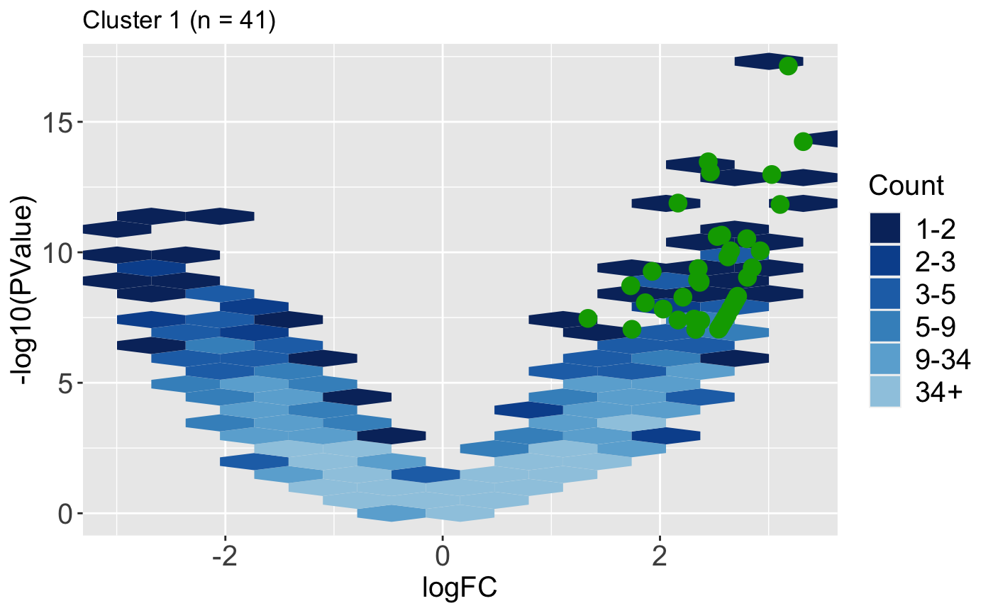
It can also be helpful to determine how the magnitude change and significance values of DEGs compare to the rest of the dataset. Do these DEGs only show large magnitude compared to the rest of the data, or do they also have small magnitude changes? The users can quickly obtain this information in visual format using the plotVolcano() function. Below we use the default option of plotting all the data as hexagon bins in the background and we superimpose the 41 DEGs from Cluster 1.
ret <- plotVolcano(data = data, dataMetrics = dataMetrics, geneList = S1S3Cluster1,
  saveFile = FALSE, pointSize = 4, pointColor = "#00A600FF")
ret[["S1_S3"]] + ggtitle(paste0("Cluster 1 (n = ", length(S1S3Cluster1), ")"))
In some cases, we may find it easier to plot all the data as individual points instead of hexagon bins. They may also wish to set the hover parameter to a value of TRUE so that they can hover over overlaid points and determine their gene IDs.
ret <- plotVolcano(data = data, dataMetrics = dataMetrics, geneList = S1S3Cluster1,
  saveFile = FALSE, pointSize = 2, pointColor = "#00A600FF", option = "allPoints",
  hover = TRUE)
ret[["S1_S3"]] %>% layout(title=paste0("Cluster 1 (n = ", length(S1S3Cluster1), ")"))
We repeat this process for the 23 DEGs from Cluster 2.
ret <- plotVolcano(data = data, dataMetrics = dataMetrics, geneList = S1S3Cluster2,
  saveFile = FALSE, pointSize = 2, pointColor = "#CC00FFFF", option = "allPoints",
  hover = TRUE)
ret[["S1_S3"]] %>% layout(title=paste0("Cluster 2 (n = ", length(S1S3Cluster2), ")"))
SummarizedExperiment Version
Below are the corresponding code blocks from everything above that now use the SummarizedExperiment object (dataSE) instead of the data and dataMetrics objects. The output should be the same.
Step 1: Side-by-side boxplot
Note that since we are not superimposing any metrics, we do not call the rowData() command. We also use the convertSEPair() function to reduce the SummarizedExperiment object from having three treatment groups (data) to only having two treatment groups, S1 and S3 (dataSE).
library(bigPint)
library(dplyr)
library(ggplot2)
library(plotly)
library(DelayedArray)
library(SummarizedExperiment)
data("soybean_cn_sub")
rownames(soybean_cn_sub) = soybean_cn_sub[,1]
data = soybean_cn_sub[,-1]
data <- DelayedArray(data)
data <- SummarizedExperiment(assays = data)
dataSE = convertSEPair(data, "S1", "S3")

str(assays(dataSE), strict.width = "wrap")
dataSE_st = dataSE
assay(dataSE_st) <- as.data.frame(t(apply(as.matrix(as.data.frame(
  assay(dataSE))), 1, scale)))
nID <- which(is.nan(as.data.frame(assay(dataSE_st))[,1]))
assay(dataSE_st)[nID,] <- 0

str(assays(dataSE_st), strict.width = "wrap")
ret <- plotPCP(dataSE=dataSE_st, saveFile = FALSE)
ret[["S1_S3"]]
Step 2: Scatterplot matrix
ret <- plotSM(dataSE=dataSE, saveFile = FALSE)
ret[["S1_S3"]]
dataSwitch = as.data.frame(assay(dataSE))
dataSE_switch <- dataSwitch[,c(1:2, 4, 3, 5:6)]
colnames(dataSE_switch) <- colnames(dataSwitch)
dataSE_switch <- DelayedArray(dataSE_switch)
dataSE_switch <- SummarizedExperiment(assays = dataSE_switch)

ret <- plotSM(dataSE=dataSE_switch, saveFile = FALSE)
ret[["S1_S3"]]
Step 3: DEG parallel coordinates and clusters
library(edgeR)
library(data.table)
data = soybean_cn_sub %>% select(ID, starts_with("S1"), starts_with("S3"))
rownames(data) = data[,1]

y = DGEList(counts=data[,-1])
group = c(1,1,1,2,2,2)
y = DGEList(counts=y, group=group)
Group = factor(c(rep("S1",3), rep("S3",3)))
design <- model.matrix(~0+Group, data=y$samples)
colnames(design) <- levels(Group)
y <- estimateDisp(y, design)
fit <- glmFit(y, design)

dataMetrics <- data.frame(ID = rownames(data))
for (i in 1:(ncol(fit)-1)){
    for (j in (i+1):ncol(fit)){
        contrast=rep(0,ncol(fit))
        contrast[i]=1
        contrast[j]=-1
        lrt <- glmLRT(fit, contrast=contrast)
        lrt <- topTags(lrt, n = nrow(y[[1]]))[[1]]

        setDT(lrt, keep.rownames = TRUE)[]
        lrt <- as.data.frame(lrt)
        colnames(lrt) <- paste0(colnames(fit)[i], "_", colnames(fit)[j], ".",
          colnames(lrt))
        colnames(lrt)[1] = "ID"

        reorderID <- full_join(data, lrt, by = "ID")
        dataMetrics <- cbind(dataMetrics, reorderID[,-c(1:ncol(data))])
    }
}

dataMetrics$ID <- as.character(dataMetrics$ID)
data <- DelayedArray(as.data.frame(assay(dataSE_st)))
dataSE_st <- SummarizedExperiment(assays = data, rowData = dataMetrics)
ret <- plotPCP(dataSE = dataSE_st, threshVal = 0.1, lineSize = 0.3,
  lineColor = "magenta", saveFile = FALSE)
ret[["S1_S3"]] + ggtitle("DEGs (FDR < 0.1)")
ret <- plotPCP(dataSE = dataSE_st, threshVal = 0.1, lineSize = 0.3,
  lineColor = "magenta", saveFile = FALSE, hover = TRUE)
ret[["S1_S3"]] %>% layout(title="DEGs (FDR < 0.1)")
ret <- plotClusters(dataSE = dataSE_st, threshVal = 0.1, nC = 2,
  colList = c("#00A600FF", "#CC00FFFF"), lineSize = 0.5, verbose = TRUE)
plot(ret[["S1_S3_2"]])
Step 4: DEG scatterplot matrix
S1S3Cluster1 <- readRDS(paste0(tempdir(), "/S1_S3_2_1.rds"))
S1S3Cluster2 <- readRDS(paste0(tempdir(), "/S1_S3_2_2.rds"))
S1S3Cluster1
S1S3Cluster2
ret <- plotSM(dataSE = dataSE, geneList = S1S3Cluster1,
  pointColor = "#00A600FF", pointSize = 1, saveFile = FALSE)
ret[["S1_S3"]] + ggtitle(paste0("Cluster 1 (n = ", length(S1S3Cluster1), ")"))
ret <- plotSM(dataSE = dataSE, geneList = S1S3Cluster2,
  pointColor = "#CC00FFFF", pointSize = 1, saveFile = FALSE)
ret[["S1_S3"]] + ggtitle(paste0("Cluster 2 (n = ", length(S1S3Cluster2), ")"))
ret <- plotSM(dataSE = dataSE_st, geneList = S1S3Cluster1,
  pointColor = "#00A600FF",pointSize = 1, saveFile = FALSE)
ret[["S1_S3"]] + ggtitle(paste0("Cluster 1 (n = ", length(S1S3Cluster1), ")"))
ret <- plotSM(dataSE = dataSE_st, geneList = S1S3Cluster2,
  pointColor = "#CC00FFFF", pointSize = 1, saveFile = FALSE)
ret[["S1_S3"]] + ggtitle(paste0("Cluster 2 (n = ", length(S1S3Cluster2), ")"))
Step 5: DEG litre plots
ret <- plotLitre(dataSE = dataSE, geneList = S1S3Cluster1[1],
  pointColor = "#00A600FF", pointSize = 2, saveFile = FALSE)
ret[[1]] + ggtitle(paste0("Cluster 1 (n = ", length(S1S3Cluster1), "): ",
    S1S3Cluster1[1]))
ret <- plotLitre(dataSE = dataSE, geneList = S1S3Cluster2[1],
  pointColor = "#CC00FFFF", pointSize = 2, saveFile = FALSE)
ret[[1]] + ggtitle(paste0("Cluster 2 (n = ", length(S1S3Cluster2), "): ",
  S1S3Cluster2[1]))
ret <- plotLitre(dataSE = dataSE_st, geneList = S1S3Cluster1[1],
  pointColor = "#00A600FF", pointSize = 2, saveFile = FALSE,
  option = "allPoints")
ret[[1]] + ggtitle(paste0("Cluster 1 (n = ", length(S1S3Cluster1), "): ",
  S1S3Cluster1[1]))
ret <- plotLitre(dataSE = dataSE_st, geneList = S1S3Cluster2[1],
  pointColor = "#CC00FFFF", pointSize = 2, saveFile = FALSE,
  option = "allPoints")
ret[[1]] + ggtitle(paste0("Cluster 2 (n = ", length(S1S3Cluster2), "): ",
  S1S3Cluster2[1]))
app <- plotLitreApp(dataSE = dataSE_st, geneList = S1S3Cluster1,
  pointColor = "#00A600FF")
if (interactive()) {
  shiny::runApp(app)
}
app <- plotLitreApp(dataSE = dataSE_st, geneList = S1S3Cluster2,
  pointColor = "#CC00FFFF")
if (interactive()) {
  shiny::runApp(app)
}
Step 6: DEG volcano plots
dataSE <- SummarizedExperiment(assays = dataSE, rowData = dataMetrics)
rowData(dataSE) <- dataMetrics

ret <- plotVolcano(dataSE = dataSE, geneList = S1S3Cluster1,
    saveFile = FALSE, pointSize = 4, pointColor = "#00A600FF")
ret[["S1_S3"]] + ggtitle(paste0("Cluster 1 (n = ", length(S1S3Cluster1), ")"))
ret <- plotVolcano(dataSE = dataSE, geneList = S1S3Cluster1, saveFile = FALSE,
  pointSize = 2, pointColor = "#00A600FF", option = "allPoints", hover = TRUE)
ret[["S1_S3"]] %>% layout(title=paste0("Cluster 1 (n = ", length(S1S3Cluster1), ")"))
ret <- plotVolcano(dataSE = dataSE, geneList = S1S3Cluster2,
  saveFile = FALSE, pointSize = 2, pointColor = "#CC00FFFF", option = "allPoints",
  hover = TRUE)
ret[["S1_S3"]] %>% layout(title=paste0("Cluster 2 (n = ", length(S1S3Cluster2), ")"))
References
Brown, Anne V., and Karen A. Hudson. 2015. “Developmental Profiling of Gene Expression in Soybean Trifoliate Leaves and Cotyledons.” BMC Plant Biology 15 (1): 169.
Chandrasekhar, T, K Thangavel, and E Elayaraja. 2012. “Effective Clustering Algorithms for Gene Expression Data.” International Journal of Computer Applications 1201: 4914.
Lauter, AN Moran, and MA Graham. 2016. “NCBI Sra Bioproject Accession: PRJNA318409.”
Love, Michael I., Wolfgang Huber, and Simon Anders. 2014. “Moderated Estimation of Fold Change and Dispersion for Rna-Seq Data with Deseq2.” Genome Biology 15 (12): 550.
Marioni, JC, CE Mason, SM Mane, M Stephens, and Y Gilad. 2008. “RNA-Seq: An Assessment of Technical Reproducibility and Comparison with Gene Expression Arrays.” Genome Research 18: 1509–17.
MD Robinson, and A Oshlack. 2010. “A Scaling Normalization Method for Differential Expression Analysis of Rna-Seq Data.” Genome Biology 11: R25.
Risso, D, K Schwartz, G Sherlock, and S Dudoit. 2011. “GC-Content Normalization for Rna-Seq Data.” BMC Bioinformatics 12: 480.
Ritchie, Matthew E., Belinda Phipson, Di Wu, Yifang Hu, Charity W. Law, Wei Shi, and Gordon K. Smyth. 2015. “Limma Powers Differential Expression Analyses for Rna-Sequencing and Microarray Studies.” Nucleic Acids Research 43 (7): e47–e47.
Robinson, Mark D., Davis J. McCarthy, and Gordon K. Smyth. 2010. “EdgeR: A Bioconductor Package for Differential Expression Analysis of Digital Gene Expression Data.” Bioinformatics 26 (1): 139–40.