Accessing static plots
Static plots can be saved as list objects in R and/or as JPG files to a directory chosen by the user. The benefit of saving plots as list objects is that users can then tailor the plots further, such as adding titles or changing label sizes. The benefit of saving plots as JPG files to a directory is that the user can more easily share the plots with other users. By default, the bigPint package will save static plots as both list objects in R and JPG files to a temporary directory (located at tempdir()).
Below is an example using all the default saving options for a static plot and an example dataset (Lauter and Graham 2016). We input the ten genes with the lowest FDR values into the plotLitre() function. This creates ten static litre plots, one for each gene. By default, these static plots are saved as JPG files in a temporary directory.
library(bigPint)
library(dplyr)
data("soybean_ir_sub")
data("soybean_ir_sub_metrics")
tenSigGenes <- soybean_ir_sub_metrics[["N_P"]] %>% select(ID) %>%
  filter(row_number() <= 10)
tenSigGenes <- tenSigGenes[,1]
soybean_ir_sub[,-1] <- log(soybean_ir_sub[,-1] + 1)
plotLitre(data=soybean_ir_sub, geneList = tenSigGenes)
If we wish to save these plots instead to a different directory, we can do so using the outDir option. The below shows us saving these ten plots instead to a directory called “LitrePlots”.
plotLitre(data=soybean_ir_sub, geneList = tenSigGenes, outDir = "LitrePlots")
We may wish to not save these plots at all to any directory. To do so, we would simply need to set the saveFile option to FALSE.
plotLitre(data=soybean_ir_sub, geneList = tenSigGenes, saveFile = FALSE)
Regardless of any input parameters we provide when creating static plots in the bigPint package, we can always render our output static plots accessible as list objects in our R software working instance. This is accomplished by saving the static plot output using the assignment operator. In the example below, we create a list object called ret that contains the ten static litre plots.
##  [1] "N_P_Glyma.19G168700.Wm82.a2.v1" "N_P_Glyma.13G293500.Wm82.a2.v1"
##  [3] "N_P_Glyma.05G188700.Wm82.a2.v1" "N_P_Glyma.13G173100.Wm82.a2.v1"
##  [5] "N_P_Glyma.11G141800.Wm82.a2.v1" "N_P_Glyma.20G083800.Wm82.a2.v1"
##  [7] "N_P_Glyma.10G118100.Wm82.a2.v1" "N_P_Glyma.11G044800.Wm82.a2.v1"
##  [9] "N_P_Glyma.11G178200.Wm82.a2.v1" "N_P_Glyma.U033600.Wm82.a2.v1"
We can now plot these static plots individually directly into our R working instance.
ret[["N_P_Glyma.19G168700.Wm82.a2.v1"]]
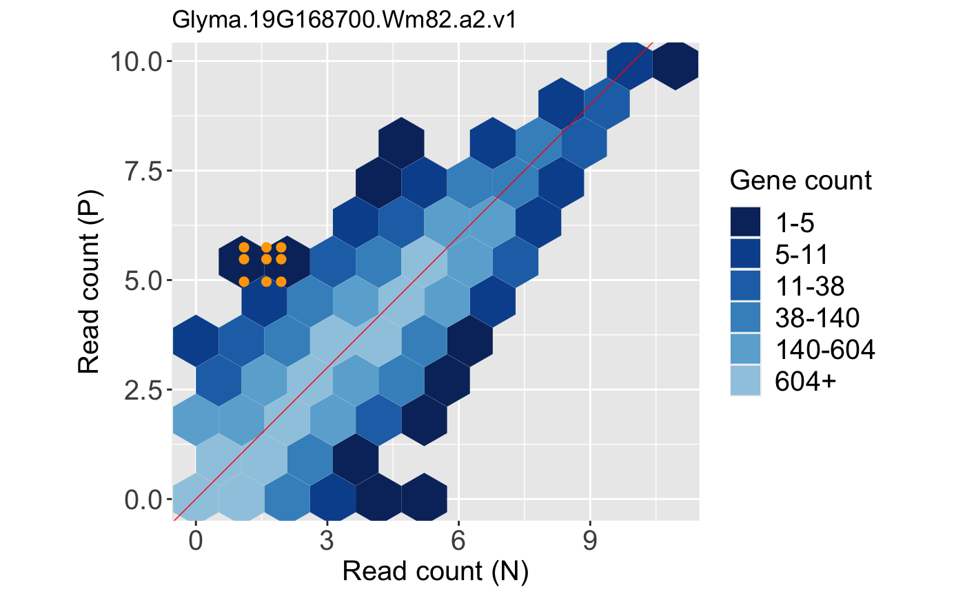
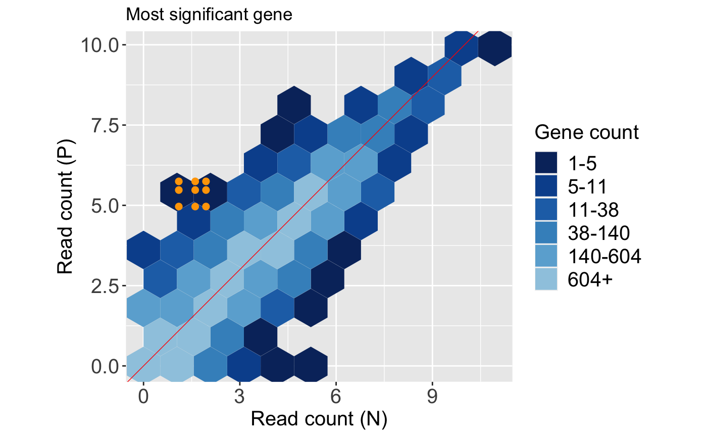
Likewise, we can tailor them. Below, we change the plot title.
Types of static plots
Currently, there are four static plots available in the bigPint package:
- Scatterplot matrix
- Litre plots
- Parallel coordinate plots
- Volcano plots
Below we provide examples on how to produce these types of plots.
Static scatterplot matrices
Scatterplot matrices are elegant plots that allow users to quickly observe the variability between all samples in a dataset. Static scatterplot matrices can be generated with the bigPint function plotSM(). As can be seen in the associated help file, this function comes with numerous input parameters. We show several examples below, but first we read in our raw data object soybean_cn_sub and data metrics object soybean_cn_sub_metrics (Brown and Hudson 2015). We also create a standardized version of our data object soybean_cn_sub_st.
library(matrixStats)
data(soybean_cn_sub)
data(soybean_cn_sub_metrics)

soybean_cn_sub_st <- as.data.frame(t(apply(as.matrix(soybean_cn_sub[,-1]), 1, scale)))
soybean_cn_sub_st$ID <- as.character(soybean_cn_sub$ID)
colLength = length(soybean_cn_sub_st)
soybean_cn_sub_st <- soybean_cn_sub_st[,c(colLength, 1:(colLength-1))]
colnames(soybean_cn_sub_st) <- colnames(soybean_cn_sub)
nID <- which(is.nan(soybean_cn_sub_st[,2]))
soybean_cn_sub_st[nID,2:length(soybean_cn_sub_st)] <- 0
Our first example uses all package defaults. It creates a scatterplot matrix of points. Since we inputted a dataMetrics object, the software will create a subset of data to be superimposed for which the default column name of “FDR” is less than the default threshold value of 0.05. The soybean_cn_sub dataset contains three treatment groups. As a result, it creates three plots as JPG files in a temporary directory because the input parameter saveFile equals TRUE by default. You can find your temporary directory by typing tempdir() into your R console.
plotSM(soybean_cn_sub, dataMetrics = soybean_cn_sub_metrics)
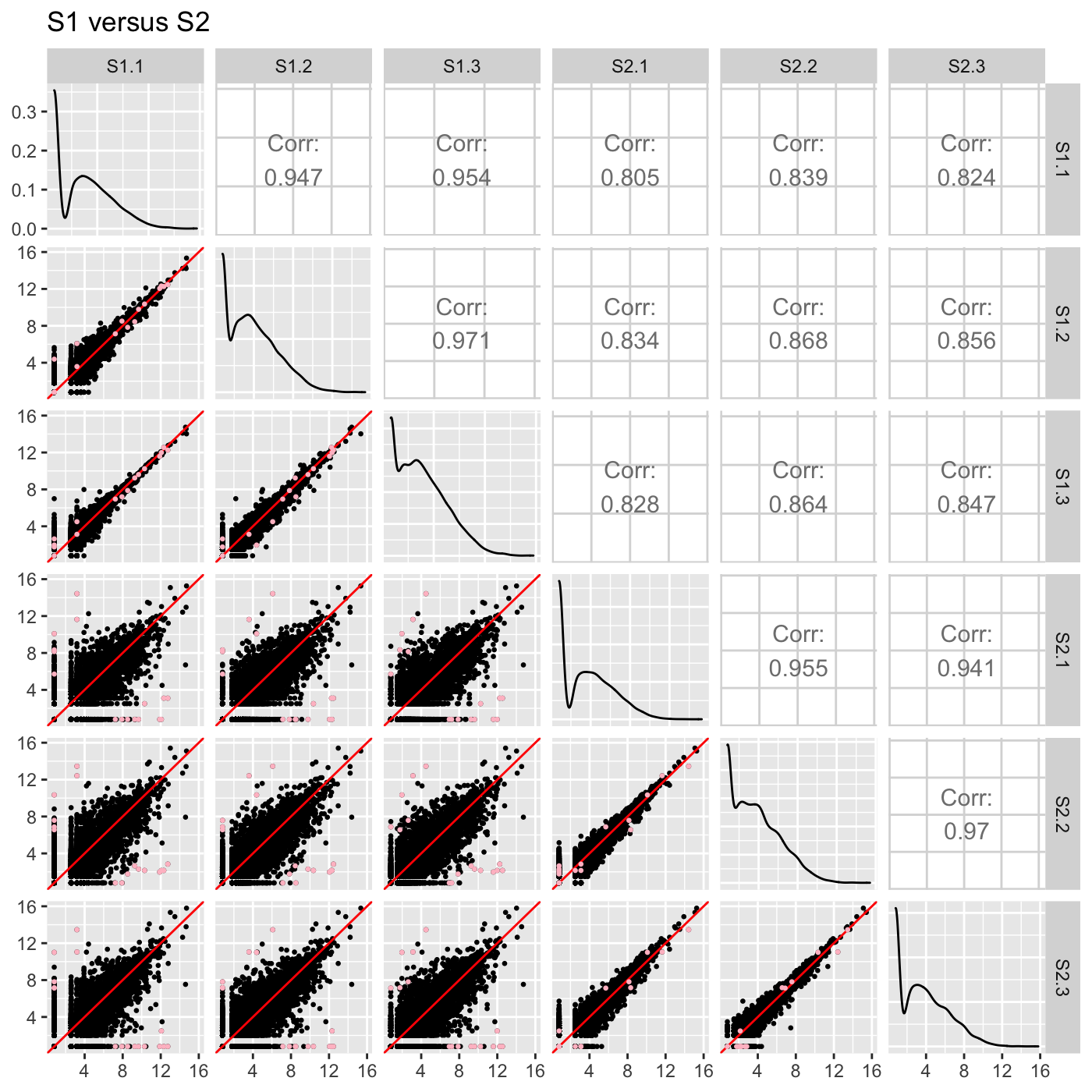
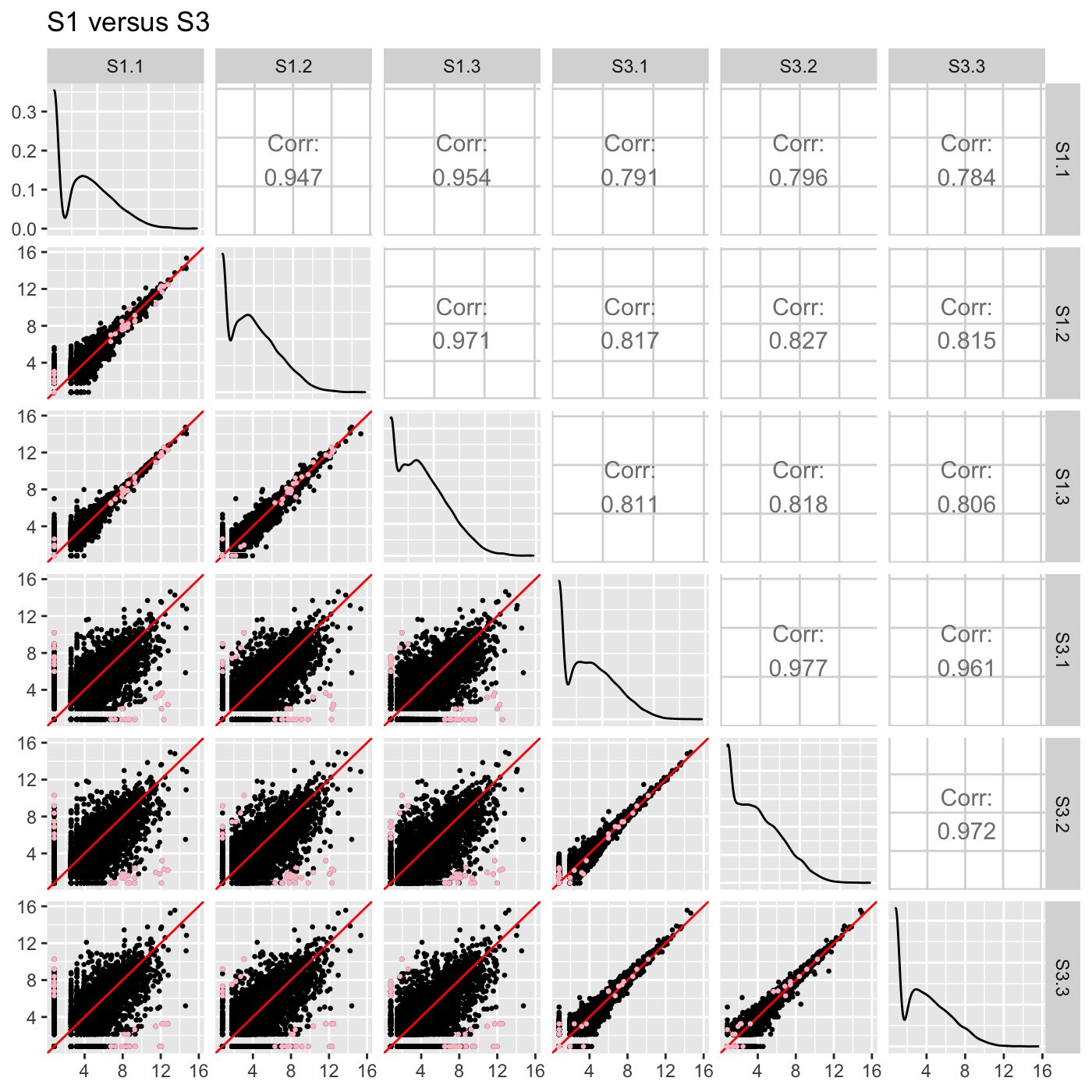
We can instead return a list of these three plots into our R session and prevent them from saving as JPG files by setting the input parameter saveFile to FALSE. The plotSM() function also contains several aesthetic parameters. Here, we change the default value of the pointColor parameter so that the data subset will be superimposed as pink points.
ret <- plotSM(soybean_cn_sub, soybean_cn_sub_metrics, pointColor = "pink",
  saveFile = FALSE)
names(ret)
## [1] "S1_S2" "S1_S3" "S2_S3"ret[["S1_S2"]] + ggtitle("S1 versus S2")
ret[["S1_S3"]] + ggtitle("S1 versus S3")
ret[["S2_S3"]] + ggtitle("S2 versus S3")
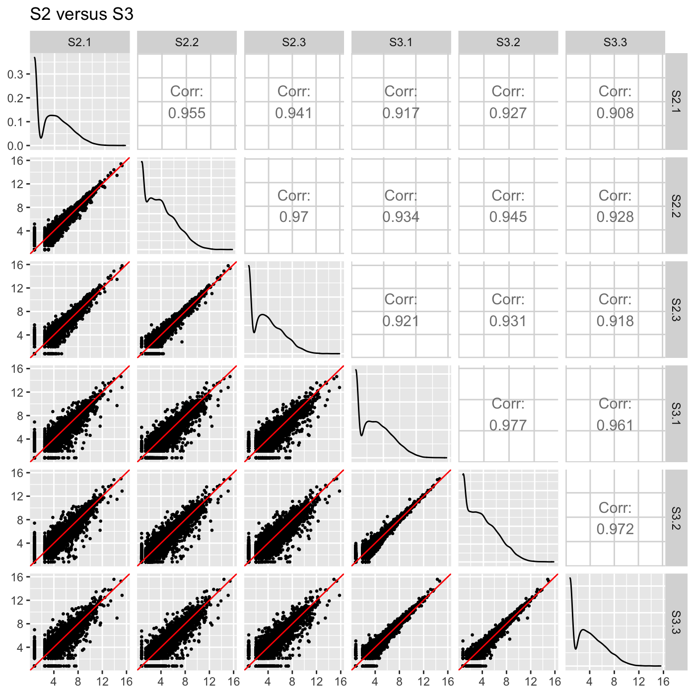
We can likewise assign the pointColor parameter to be a hexadecimal RGB color specification. Here, we create a similar plot with kelly green superimposed points. We now use the standardized version of our data object soybean_cn_sub_st.
ret <- plotSM(soybean_cn_sub_st, soybean_cn_sub_metrics, pointColor = "#00C379",
  saveFile = FALSE)
ret[[1]] + xlab("Standardized read counts") + ylab("Standardized read counts")
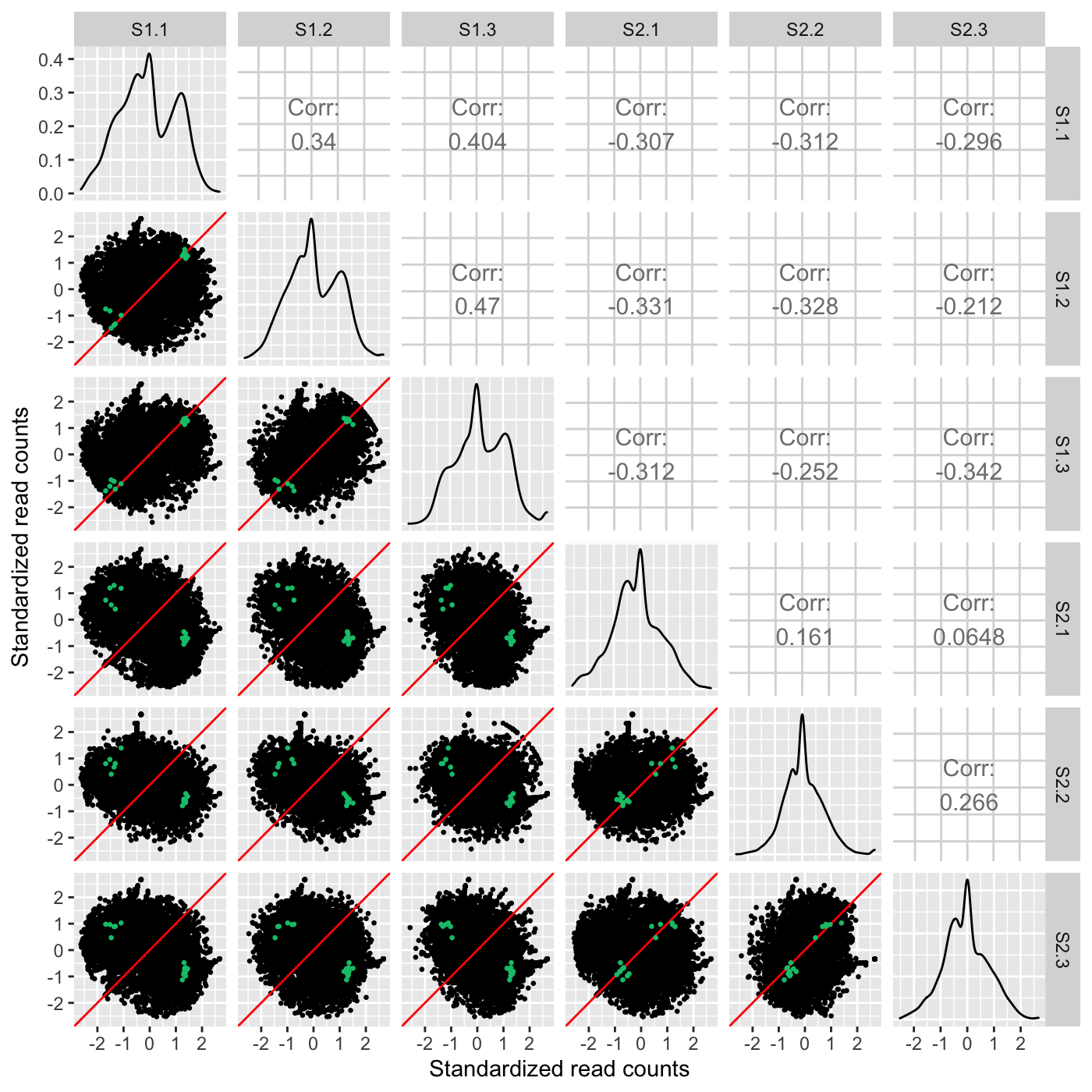
As our next three examples show, the plotSM() function also has an input paramater called option. We have thusfar used the default value of “allPoints” for this parameter. However, there are three other options for this parameter that can tailor the scatterplot matrix in other meaningful ways. One option “hexagon” will render the full dataset as hexagon bins as follows.
ret <- plotSM(soybean_cn_sub, soybean_cn_sub_metrics, option = "hexagon", xbins = 5,
  pointSize = 0.1, saveFile = FALSE)
ret[[2]]
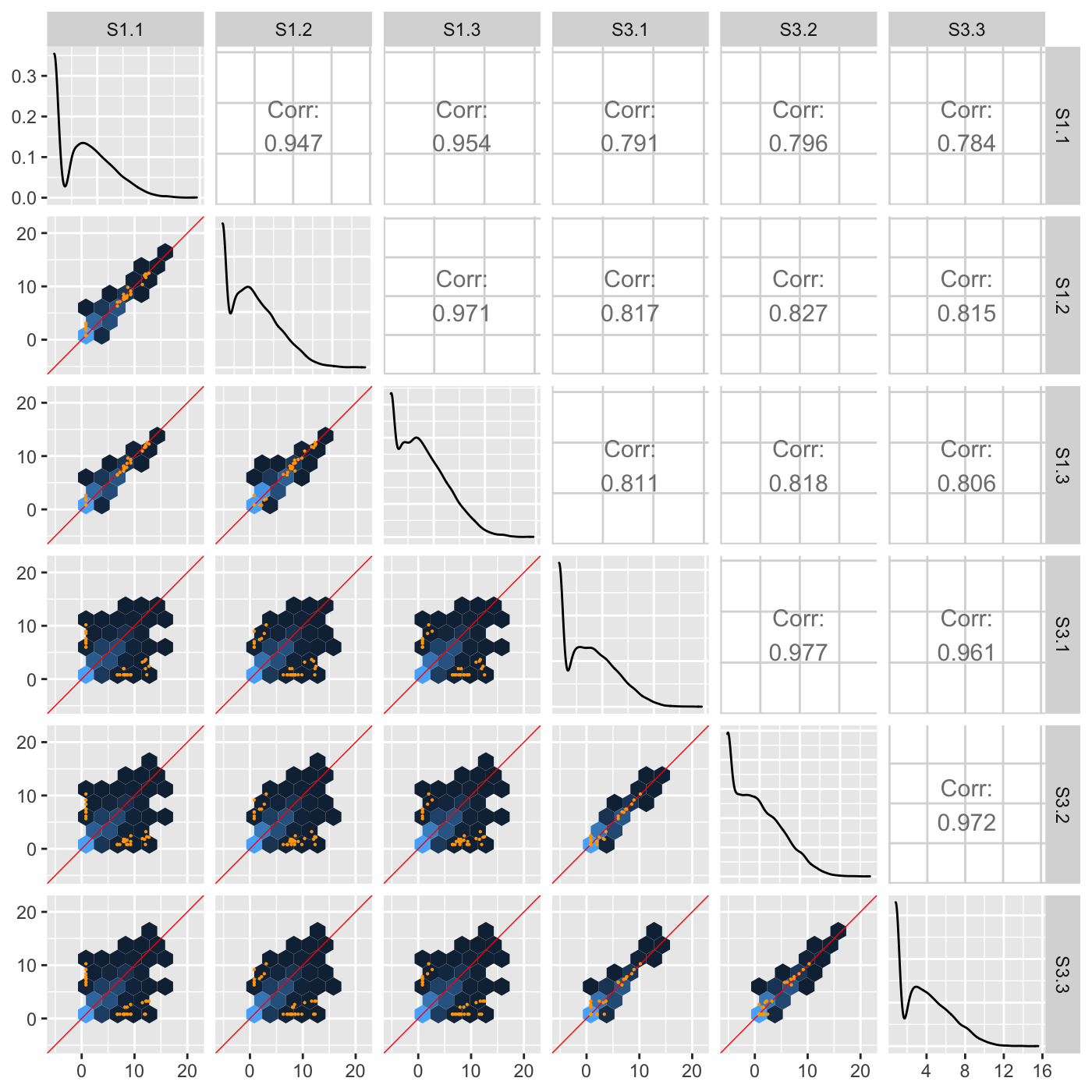
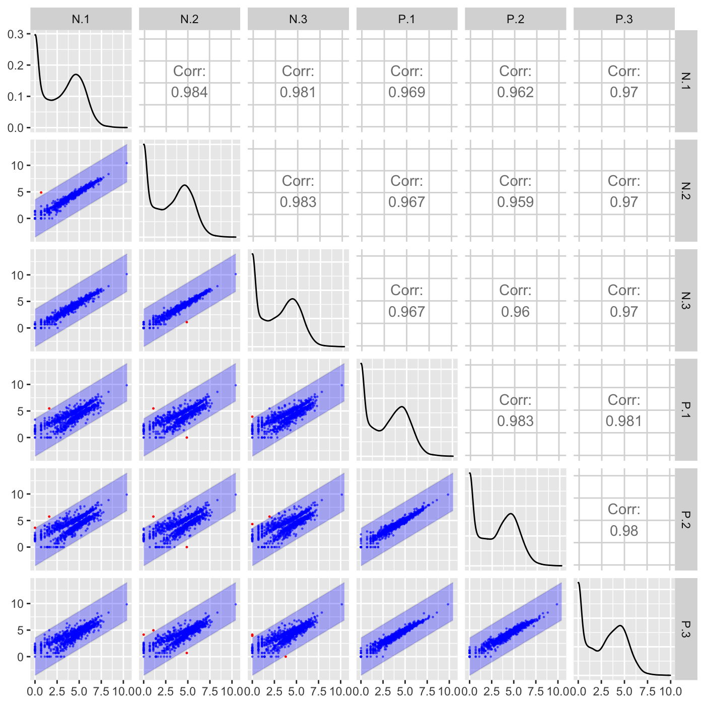
Another option “orthogonal” will plot data points related to an orthogonal distance from the x=y line in each scatterplot. In the following example, only data points that pass a threshold of orthogonal distance from the x=y line are plotted in each scatterplot. The orthogonal threshold is represented by a lavendar shade.
ret <- plotSM(soybean_ir_sub, option = "orthogonal", threshOrth = 2.5,
  pointSize = 0.2, saveFile = FALSE)
ret[[1]]
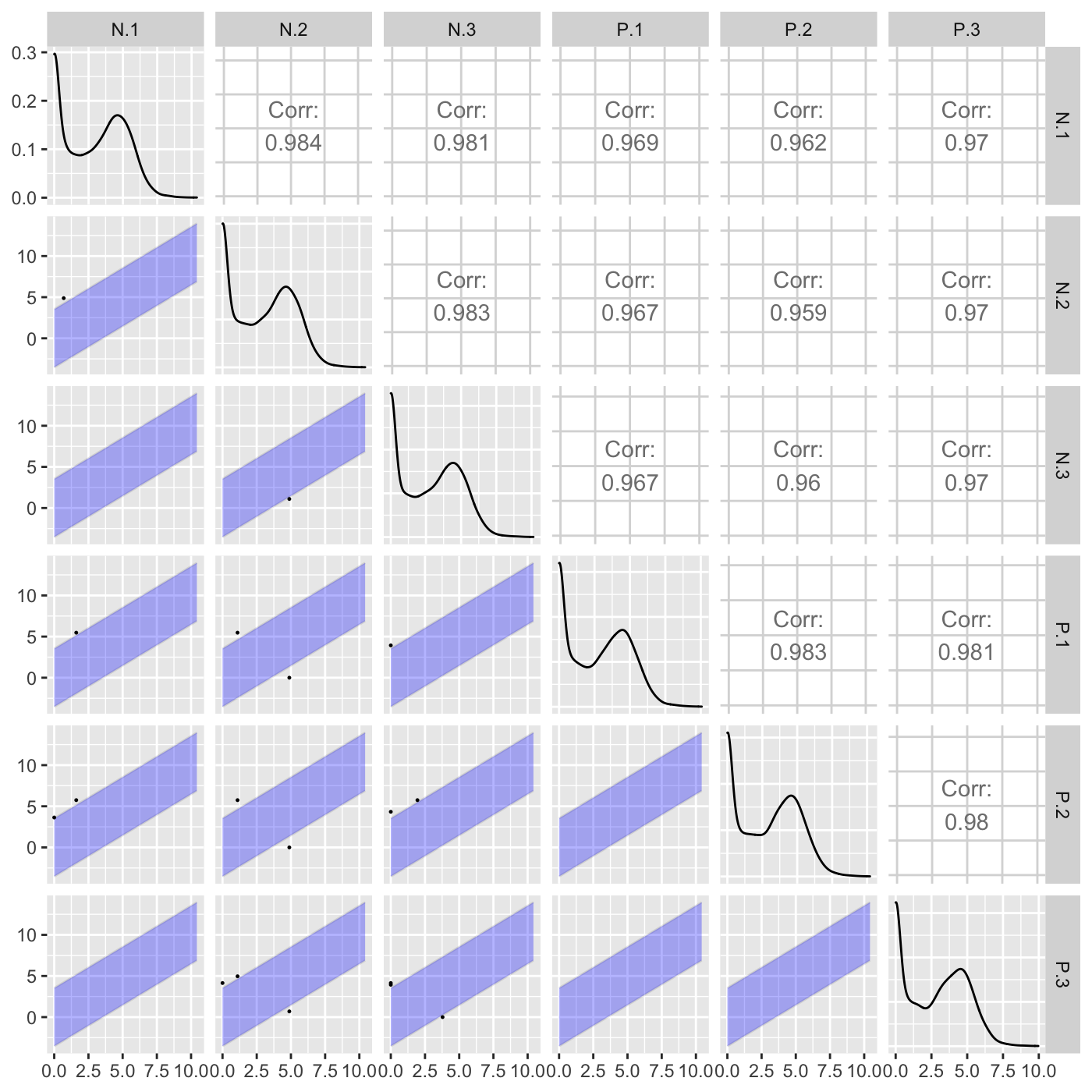
Above, we did not input any genes to be superimposed (through the geneList or dataMetrics parameters), so we simply examined which genes exceeded an orthogonal distance of 2.5 from the x=y line. Here, we specify that we now wish to superimpose a subset of genes that have an FDR value less than 0.05. Genes that pass the orthogonal threshold and were differentially expressed (FDR < 0.05) are colored red. Genes that did not pass the orthogonal threshold and were differentially expressed (FDR < 0.05) are colored blue. Genes that pass the orthogonal threshold but were not differentially expressed (FDR > 0.05) are colored grey.
ret <- plotSM(soybean_ir_sub, soybean_ir_sub_metrics, option = "orthogonal",
  threshOrth = 2.5, pointSize = 0.2, saveFile = FALSE)
ret[[1]]
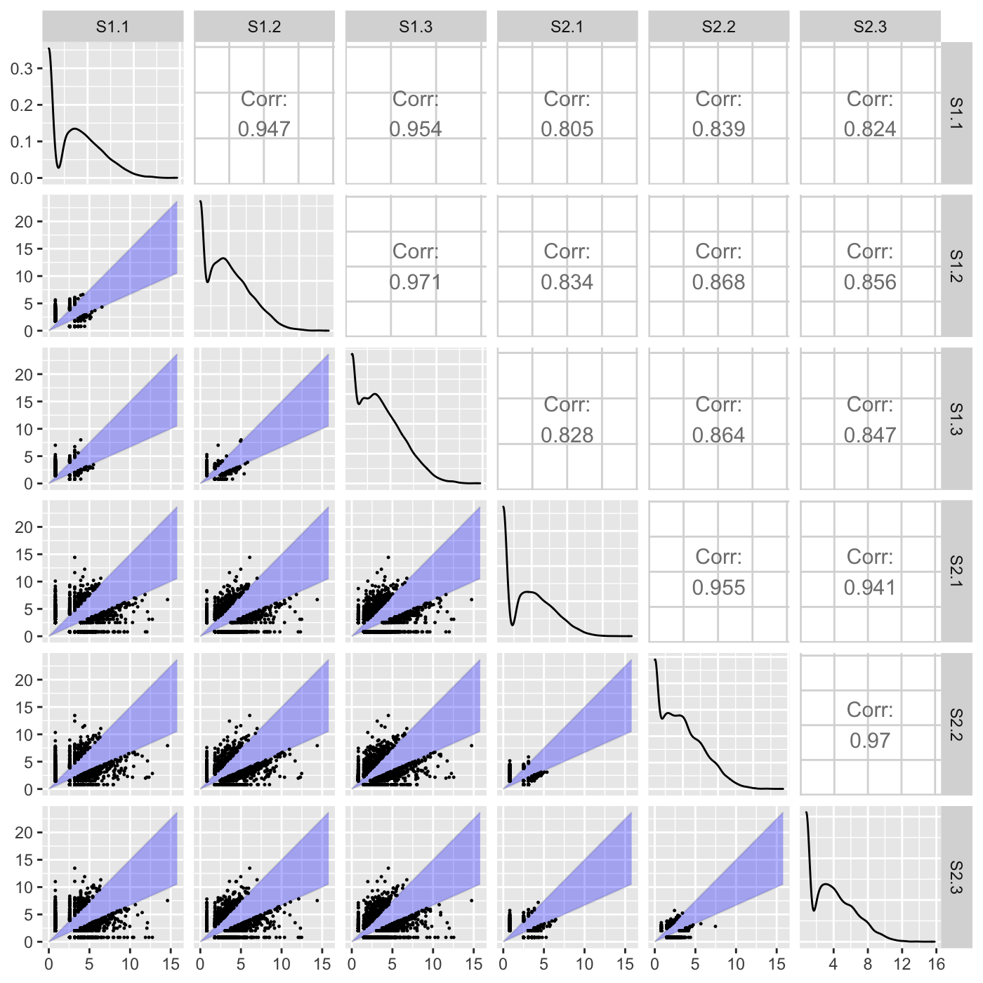
The last option “foldChange” will plot data points related to a fold change value. In the following example, only data points that pass a fold change threshold of 0.5 are plotted in each scatterplot. The fold change threshold is represented by a lavendar shade.
ret <- plotSM(soybean_cn_sub, option = "foldChange", threshFC = 0.5, pointSize = 0.2,
  saveFile = FALSE)
ret[[1]]
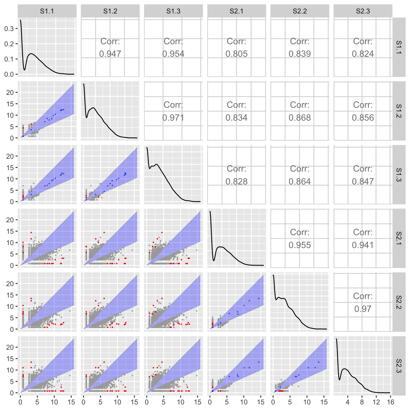
Above, we did not input any genes to be superimposed (through the geneList or dataMetrics parameters), so we simply examined which genes exceeded a fold change of 0.5. Here, we specify that we now wish to superimpose a subset of genes that have an FDR value less than 0.05. Genes that pass the fold change threshold and were differentially expressed (FDR < 0.05) are colored red. Genes that did not pass the fold change threshold and were differentially expressed (FDR < 0.05) are colored blue. Genes that pass the fold change threshold but were not differentially expressed (FDR > 0.05) are colored grey.
ret <- plotSM(soybean_cn_sub, soybean_cn_sub_metrics, option = "foldChange",
  threshFC = 0.5, pointSize = 0.2, saveFile = FALSE)
ret[[1]]
Static litre plots
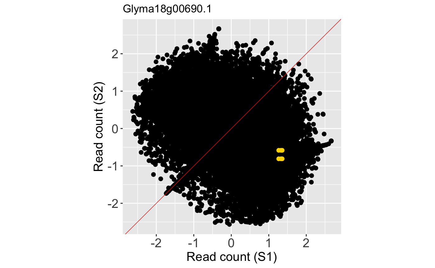
Litre plots allow users to quickly superimpose a gene of interest onto the distribution of the full dataset. Static litre plots can be generated with the bigPint function plotLitre(). In this example, we examine the most differentially expressed gene between the S1 and S2 treatment groups in the soybean_cn_sub_st dataset. We also now view the standardized read counts.
geneList = soybean_cn_sub_metrics[["S1_S2"]][1:5,]$ID
ret <- plotLitre(data = soybean_cn_sub_st[,c(1:7)], geneList = geneList,
  pointColor = "gold", saveFile = FALSE)
names(ret)
## [1] "S1_S2_Glyma18g00690.1" "S1_S2_Glyma08g22380.1" "S1_S2_Glyma20g30460.1"
## [4] "S1_S2_Glyma07g09700.1" "S1_S2_Glyma10g31780.1"ret[["S1_S2_Glyma18g00690.1"]]
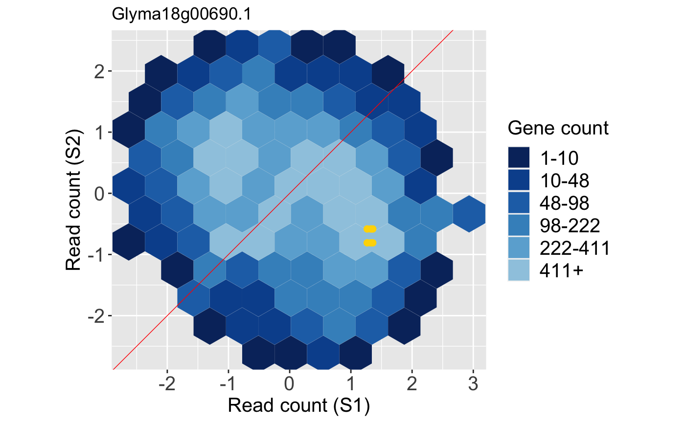
We can examine the same litre plot, but now plot the full dataset in the background as points rather than the default hexagons. We do this by setting the option parameter to a value of allPoints. The benefit of this approach over the previous plot is that we are no longer looking at summarization (hexagon bins) of the background information. However, the benefit of the prevoius plot was that we could overcome overplotting problems and ascertain how many points were in a given area due to the count information provided by the hexagon bins.
ret <- plotLitre(data = soybean_cn_sub_st[,c(1:7)], geneList = geneList,
  pointColor = "gold", saveFile = FALSE, option = "allPoints")
ret[["S1_S2_Glyma18g00690.1"]]
Static parallel coordinates
Static parallel coordinate plots can be generated with the bigPint function plotPCP(). Here we superimpose the ten genes with the lowest FDR values from the soybean_ir_sub data as purple lines.
geneList = soybean_ir_sub_metrics[["N_P"]][1:10,]$ID
ret <- plotPCP(data = soybean_ir_sub, geneList = geneList, lineSize = 0.7,
  lineColor = "purple", saveFile = FALSE)
ret[[1]]
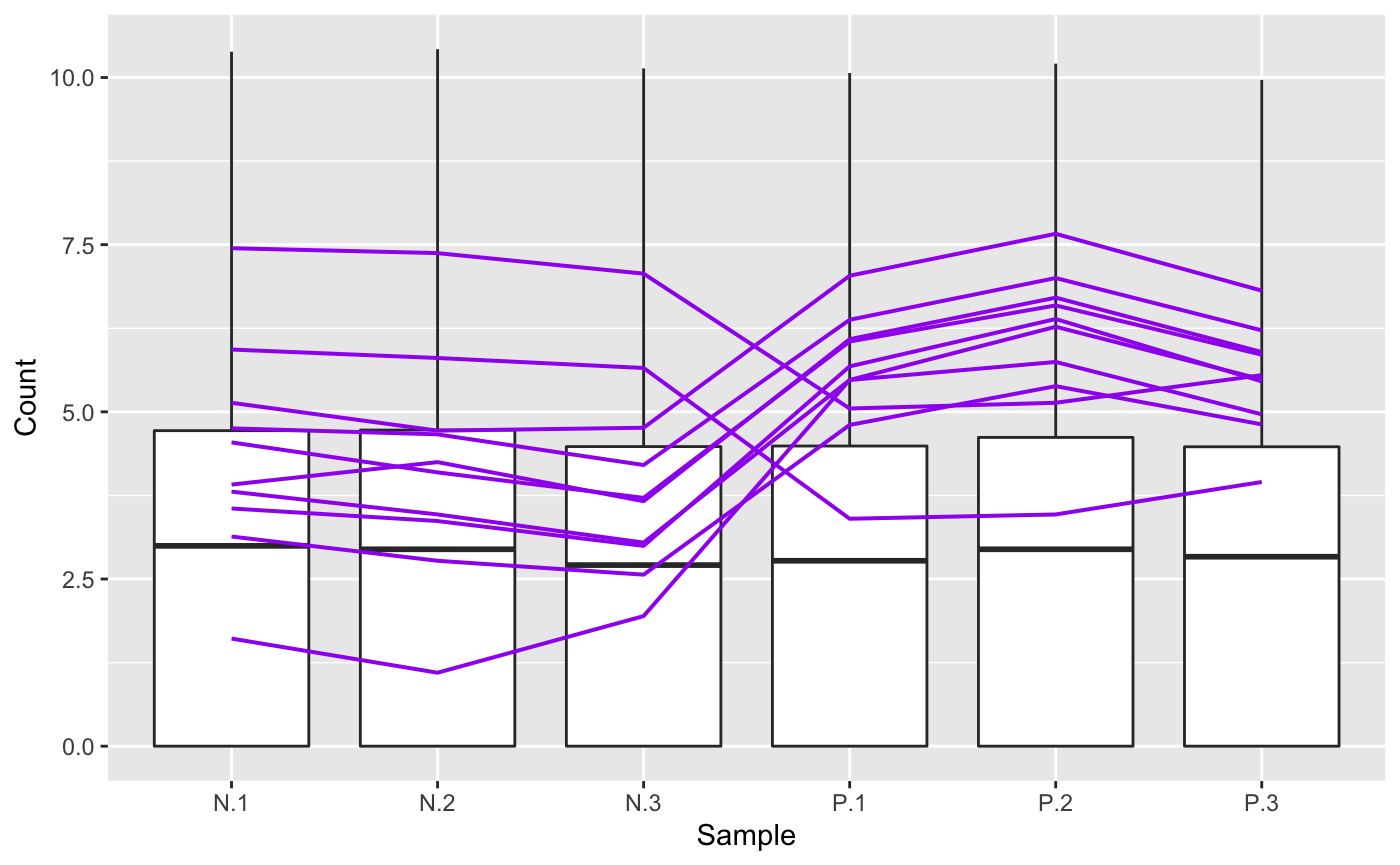
We may wish to recreate the above plot but allow us to quickly identify each of the ten genes. We can achieve this functionality by setting the hover parameter to a value of TRUE. Note this approach does incoroporate a bit of interactivity into our plot even though it is part of the static plotPCP() function. The capabilities in the interactive parallel coordinate plot plotPCPApp() extend upon this functionality.
ret <- plotPCP(data = soybean_ir_sub, geneList = geneList, lineSize = 0.4,
  lineColor = "purple", saveFile = FALSE, hover = TRUE)
ret[[1]]
We note that users can again refrain from defining a subeset of data to be superimposed as parallel coordinate lines by retaining the default NULL values for parameters geneList and dataMetrics. In this case, we will simply plot the background side-by-side boxplots that show the distribution of all read counts in the data.
ret <- plotPCP(data = soybean_ir_sub, saveFile = FALSE)
ret[[1]]
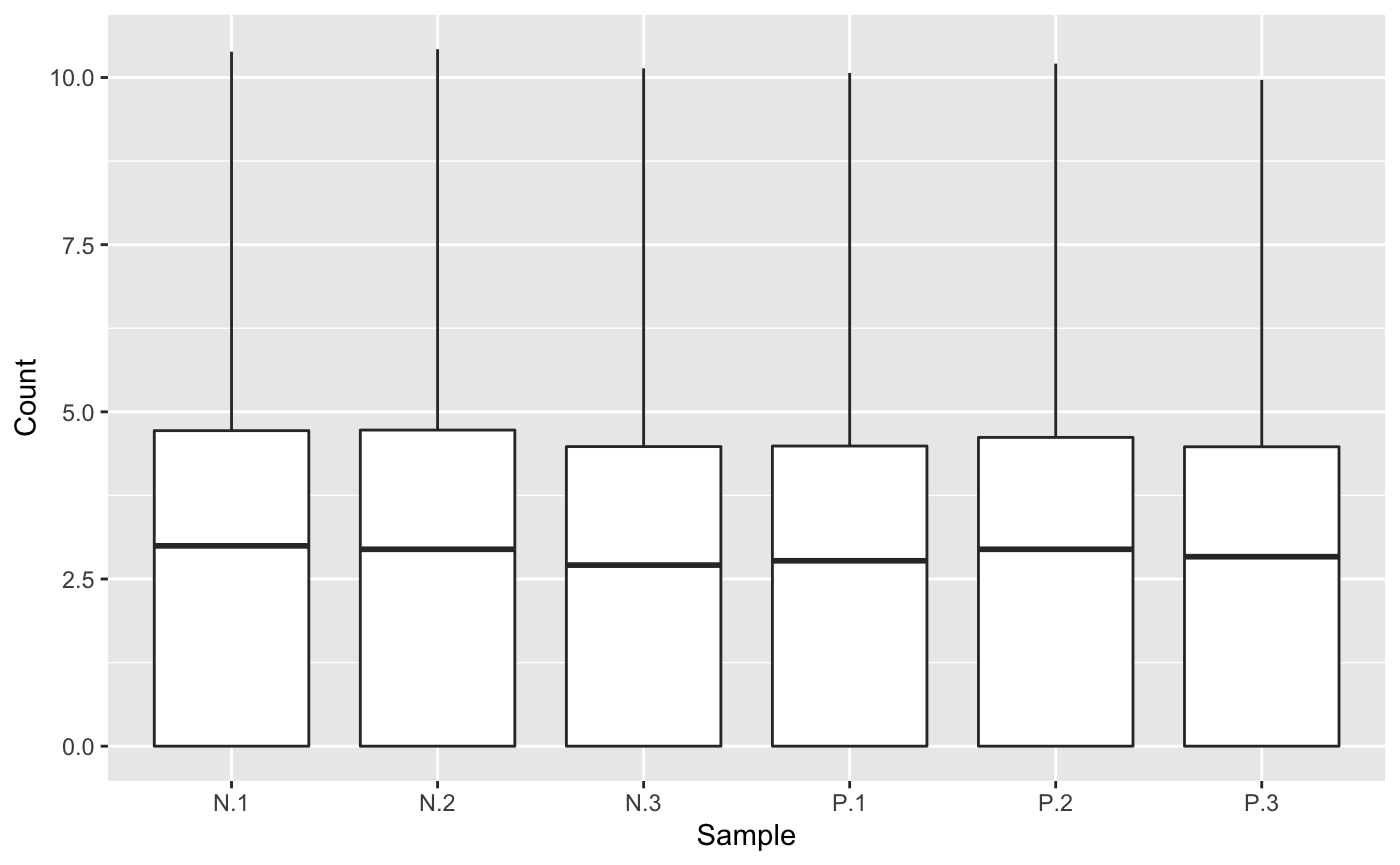
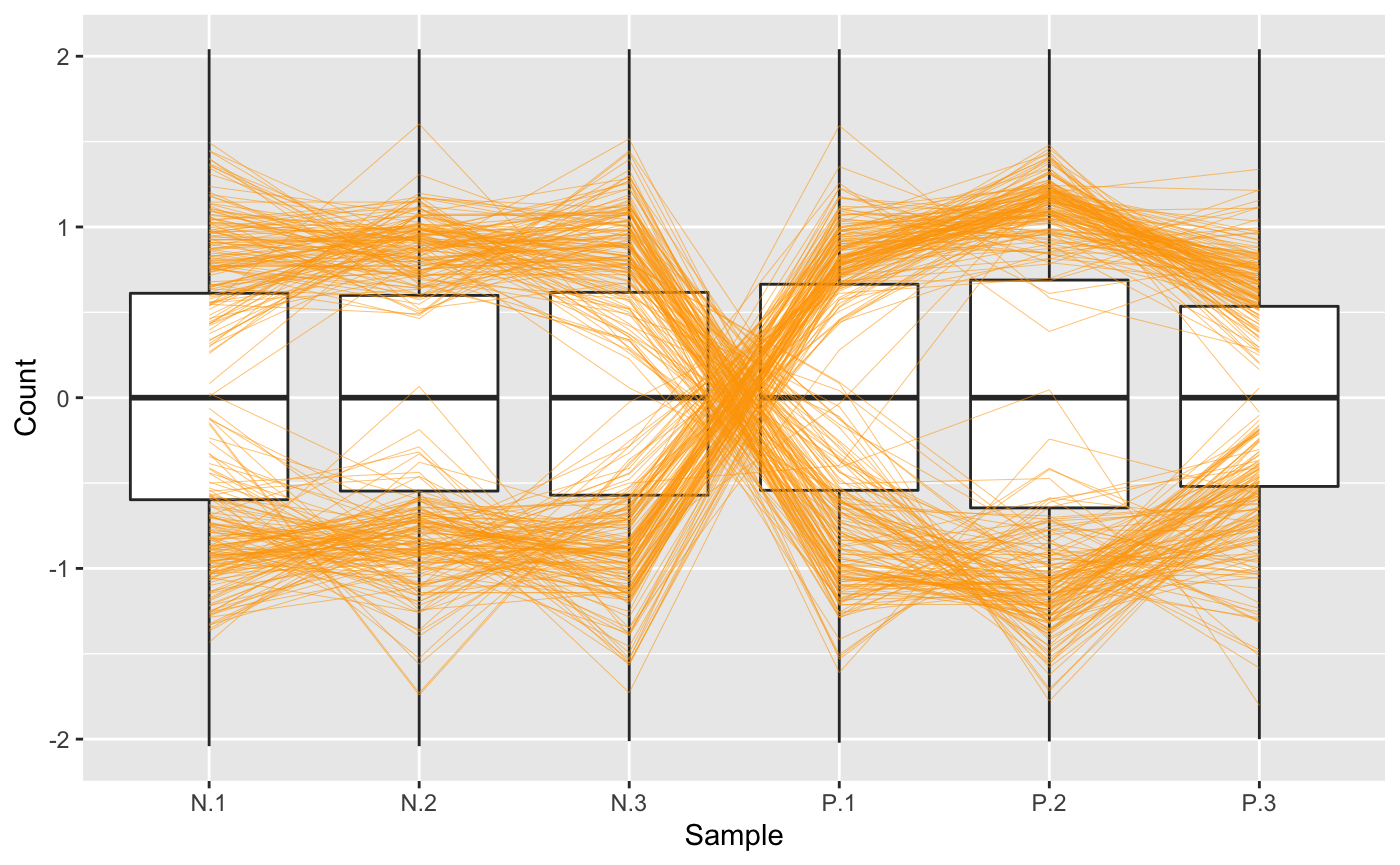
A user may note that the side-by-side boxplots above did not have precisely equal five number summaries. In this case, users can perform different preprocessing techniques on the read counts and use the plots to check that they believe the full data looks sufficiently normalized across samples. Here, we create a normalized and standardized version of the soybean_ir_sub dataset (soybean_ir_sub_ns) and then superimpose a subset of genes with an FDR value less than 1e-4 as parallel coordinate lines. We can confirm that the side-by-side boxplots do appear more consistent across the samples now.
library(EDASeq)
library(edgeR)
dataID <- soybean_ir_sub$ID
data2 = as.matrix(soybean_ir_sub[,-1])
d = DGEList(counts=data2, lib.size=rep(1,6))
cpm.data.new <- cpm(d, TRUE, TRUE)
soybean_ir_sub_n <- betweenLaneNormalization(cpm.data.new, which="full", round=FALSE)
soybean_ir_sub_n = as.data.frame(soybean_ir_sub_n)
soybean_ir_sub_n$ID <- dataID
soybean_ir_sub_n = soybean_ir_sub_n[,c(7,1:6)]
soybean_ir_sub_ns = as.data.frame(t(apply(as.matrix(soybean_ir_sub_n[,-1]), 1, scale)))
soybean_ir_sub_ns$ID = as.character(soybean_ir_sub_n$ID)
soybean_ir_sub_ns = soybean_ir_sub_ns[,c(7,1:6)]
colnames(soybean_ir_sub_ns) = colnames(soybean_ir_sub_n)
nID = which(is.nan(soybean_ir_sub_ns[,2]))
soybean_ir_sub_ns[nID,2:length(soybean_ir_sub_ns)] = 0

ret <- plotPCP(data = soybean_ir_sub_ns, dataMetrics = soybean_ir_sub_metrics,
  threshVal = 1e-4, saveFile = FALSE)
ret[["N_P"]]
Static volcano plots
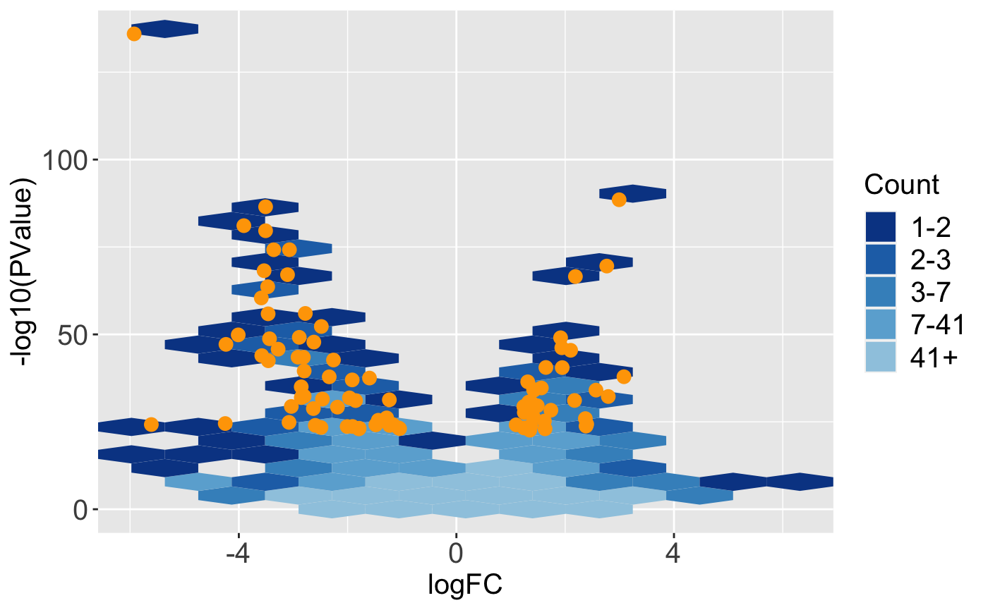
The bigPint function plotVolcano() allows users to plot static volcano plots. Below is an example in which the genes with a FDR values less than 1e-8 are overlaid as orange points onto the full dataset represented as hexbins.
ret <- plotVolcano(soybean_ir_sub, soybean_ir_sub_metrics, threshVal = 1e-8,
  pointSize = 3, saveFile = FALSE)
ret[["N_P"]]
In this next example, the geneList object we created earlier (the ten genes with the lowest FDR values) are superimposed as pink points onto the full dataset represented as points.
ret <- plotVolcano(soybean_ir_sub, soybean_ir_sub_metrics, geneList = geneList,
  option = "allPoints", pointColor = "deeppink", pointSize = 3, saveFile = FALSE)
ret[["N_P"]]
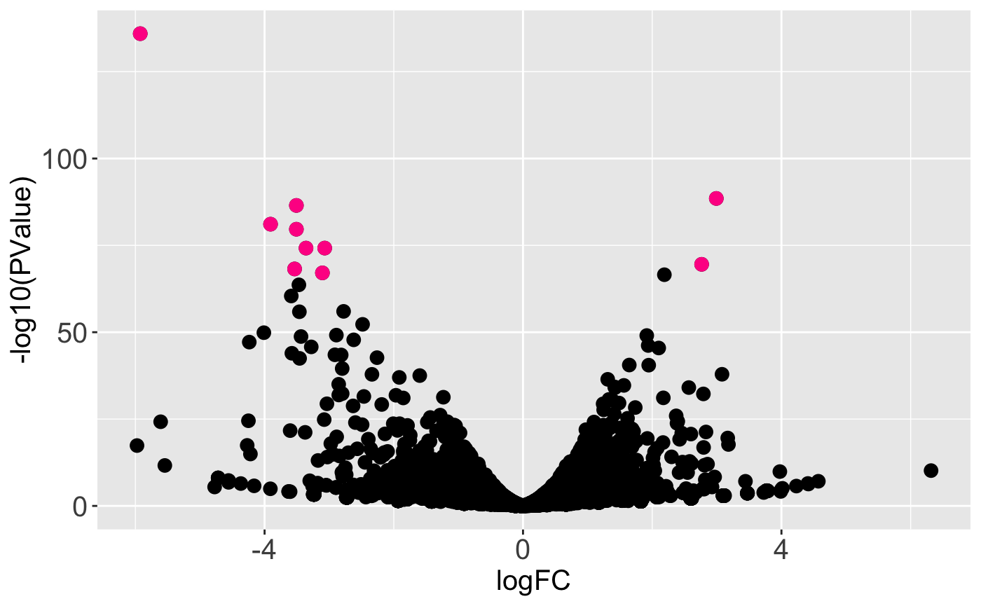
We may wish to recreate the above plot but allow us to quickly identify DEGs. For instance, there is one DEG in the top-left corner of the plot that appears as an outlier in terms of magnitude change and statistical significance. Which gene is it? We can achieve this functionality by setting the hover parameter to a value of TRUE. Note this approach does incoroporate a bit of interactivity into our plot even though it is part of the static plotVolcano() function. The capabilities in the interactive volcano plot plotVolcanoApp() extend upon this functionality.
ret <- plotVolcano(soybean_ir_sub, soybean_ir_sub_metrics, geneList = geneList,
  option = "allPoints", pointColor = "deeppink", pointSize = 2, saveFile = FALSE,
  hover = TRUE)
ret[["N_P"]]
SummarizedExperiment Version
Below are the corresponding code blocks from everything above that now use the SummarizedExperiment object (dataSE) instead of the data and dataMetrics objects.
Accessing static plots
data("se_soybean_ir_sub")
tenSigGenes <- as.data.frame(rowData(se_soybean_ir_sub)) %>% arrange(N_P.FDR)
  %>% filter(row_number() <= 10)
tenSigGenes <- tenSigGenes[,1]
assay(se_soybean_ir_sub) <- log(as.data.frame(assay(se_soybean_ir_sub))+1)
plotLitre(dataSE=se_soybean_ir_sub, geneList = tenSigGenes)plotLitre(dataSE=se_soybean_ir_sub, geneList = tenSigGenes, outDir = "LitrePlots")
plotLitre(dataSE=se_soybean_ir_sub, geneList = tenSigGenes, saveFile = FALSE)
ret <- plotLitre(dataSE=se_soybean_ir_sub, geneList = tenSigGenes,
  saveFile = FALSE)
names(ret)
ret[["N_P_Glyma.19G168700.Wm82.a2.v1"]]
Static scatterplot matrices
library(matrixStats)
data(soybean_cn_sub)
data(soybean_cn_sub_metrics)

data("se_soybean_cn_sub")
se_soybean_cn_sub_st = se_soybean_cn_sub
assay(se_soybean_cn_sub_st) <- as.data.frame(t(apply(as.matrix(as.data.frame
  (assay(se_soybean_cn_sub))), 1, scale)))
nID <- which(is.nan(as.data.frame(assay(se_soybean_cn_sub_st))[,1]))
assay(se_soybean_cn_sub_st)[nID,] <- 0
plotSM(dataSE = se_soybean_cn_sub)
ret <- plotSM(dataSE = se_soybean_cn_sub, pointColor = "pink",
  saveFile = FALSE)
names(ret)
ret[["S1_S2"]] + ggtitle("S1 versus S2")
ret[["S1_S3"]] + ggtitle("S1 versus S3")
ret[["S2_S3"]] + ggtitle("S2 versus S3")
ret <- plotSM(dataSE = se_soybean_cn_sub_st, pointColor = "#00C379",
  saveFile = FALSE)
ret[[1]] + xlab("Standardized read counts") + ylab("Standardized read counts")
ret <- plotSM(dataSE = se_soybean_cn_sub, option = "hexagon", xbins = 5,
  pointSize = 0.1, saveFile = FALSE)
ret[[2]]
To avoid overlaying metrics information, we set the rowData() to NULL.
se_soybean_ir_sub_nm <- se_soybean_ir_sub
rowData(se_soybean_ir_sub_nm) <- NULL
ret <- plotSM(dataSE = se_soybean_ir_sub_nm, option = "orthogonal",
  threshOrth = 2.5, pointSize = 0.2, saveFile = FALSE)
ret[[1]]
ret <- plotSM(dataSE = se_soybean_ir_sub, option = "orthogonal",
  threshOrth = 2.5, pointSize = 0.2, saveFile = FALSE)
ret[[1]]
To avoid overlaying metrics information, we set the rowData() to NULL.
se_soybean_cn_sub_nm <- se_soybean_cn_sub
rowData(se_soybean_cn_sub_nm) <- NULL
ret <- plotSM(dataSE = se_soybean_cn_sub_nm, option = "foldChange",
  threshFC = 0.5, pointSize = 0.2, saveFile = FALSE)
ret[[1]]
ret <- plotSM(dataSE = se_soybean_cn_sub, option = "foldChange",
  threshFC = 0.5, pointSize = 0.2, saveFile = FALSE)
ret[[1]]
Static litre plots
geneList <- as.data.frame(rowData(se_soybean_cn_sub_st)) %>%
  arrange(S1_S2.FDR) %>% filter(row_number() <= 5)
geneList <- geneList[,1]
We use the convertSEPair() function to reduce the SummarizedExperiment object from having three treatment groups (se_soybean_cn_sub_st) to only having two treatment groups, S1 and S2 (se_soybean_cn_sub_st_S1S2).
se_soybean_cn_sub_st_S1S2 <- convertSEPair(se_soybean_cn_sub_st, "S1", "S2")
ret <- plotLitre(dataSE = se_soybean_cn_sub_st_S1S2, geneList = geneList,
  pointColor = "gold", saveFile = FALSE)
names(ret)
ret[["S1_S2_Glyma18g00690.1"]]
ret <- plotLitre(dataSE = se_soybean_cn_sub_st_S1S2, geneList = geneList,
  pointColor = "gold", saveFile = FALSE, option = "allPoints")
ret[["S1_S2_Glyma18g00690.1"]]
Static parallel coordinates
geneList <- as.data.frame(rowData(se_soybean_ir_sub)) %>% arrange(N_P.FDR) %>%
  filter(row_number() <= 10)
geneList <- geneList[,1]
ret <- plotPCP(dataSE = se_soybean_ir_sub, geneList = geneList, lineSize = 0.7,
  lineColor = "purple", saveFile = FALSE)
ret[[1]]
ret <- plotPCP(dataSE = se_soybean_ir_sub, geneList = geneList, lineSize = 0.4,
  lineColor = "purple", saveFile = FALSE, hover = TRUE)
ret[[1]]
To avoid overlaying metrics information, we set the rowData() to NULL.
se_soybean_ir_sub_nm <- se_soybean_ir_sub
rowData(se_soybean_ir_sub_nm) <- NULL
ret <- plotPCP(dataSE = se_soybean_ir_sub_nm, saveFile = FALSE)
ret[[1]]
library(EDASeq)
library(edgeR)
dataFrame <- as.data.frame(assay(se_soybean_ir_sub))
dataID <- rownames(dataFrame)
data2 = as.matrix(dataFrame)
d = DGEList(counts=data2, lib.size=rep(1,6))
cpm.data.new <- cpm(d, TRUE, TRUE)
dataFrame_n <- betweenLaneNormalization(cpm.data.new, which="full",
  round=FALSE)
dataFrame_n = as.data.frame(dataFrame_n)
dataFrame_ns = dataFrame_n
dataFrame_ns = as.data.frame(t(apply(as.matrix(dataFrame_n), 1, scale)))
nID = which(is.nan(dataFrame_ns[,2]))
dataFrame_ns[nID,] = 0
colnames(dataFrame_ns) = colnames(dataFrame_n)
se_soybean_ir_sub_ns = se_soybean_ir_sub
assay(se_soybean_ir_sub_ns) = dataFrame_ns
ret <- plotPCP(dataSE = se_soybean_ir_sub_ns, threshVal = 1e-4,
  saveFile = FALSE)
ret[["N_P"]]
Static volcano plots
ret <- plotVolcano(dataSE = se_soybean_ir_sub, threshVal = 1e-8,
  pointSize = 3, saveFile = FALSE)
ret[["N_P"]]
ret <- plotVolcano(dataSE = se_soybean_ir_sub, geneList = geneList,
  option = "allPoints", pointColor = "deeppink", pointSize = 3,
  saveFile = FALSE)
ret[["N_P"]]
ret <- plotVolcano(dataSE = se_soybean_ir_sub, geneList = geneList,
  option = "allPoints", pointColor = "deeppink", pointSize = 2,
  saveFile = FALSE,
  hover = TRUE)
ret[["N_P"]]